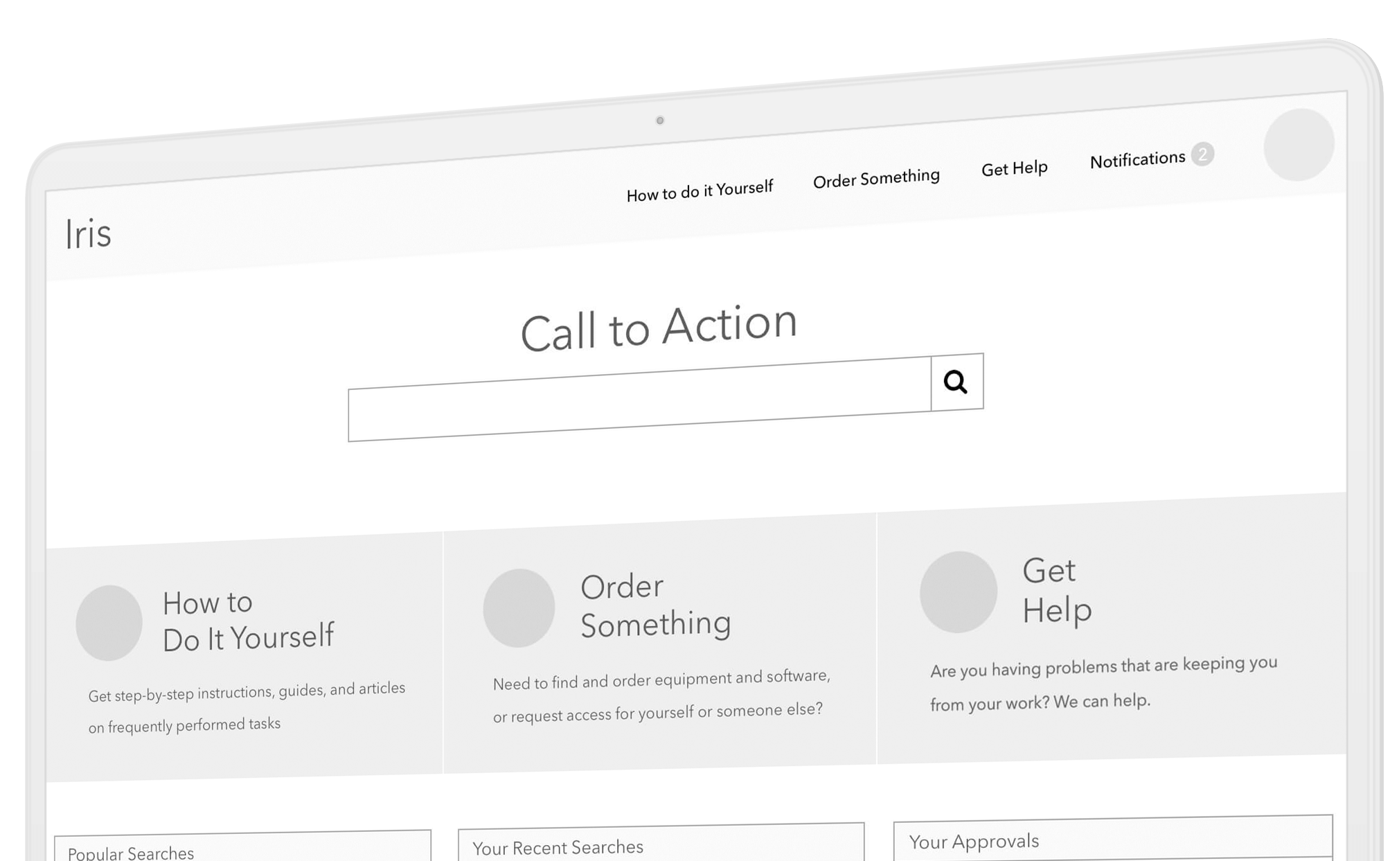
IT Service Portal
Johnson & Johnson
Improving support ticket submission rates.
Overview
I was contracted to run a discovery to identify the requirements for refining the Johnson & Johnson internal ticketing tool 'Iris'. The client had an internal ticketing tool to request IT support like getting a new office phone set up, ordering a new computer, requesting software, etc. Yet, their employees were calling customer support for help with issues that the automated ticketing tool could support at a high rate. The client wanted to decrease the number of calls into the support line and increase the use of the automated ticketing app.
Role
Product Designer
Scope
Eight Weeks
Tools
Research, Observation, Testing, Documentation, Presentation, Sketch, InVision
Approach
Problem Statement
Users were calling IT support more than using the self-service method through the company intranet. Every phone call to support costs 10 to 20 times the cost of using the self-service tool.
Goals
- Improve awareness of the self-service platform
- Improve flow through the product
- Make the self-service option more prominent
- Reduce the user impulse to call IT before seeking to solve their issue first
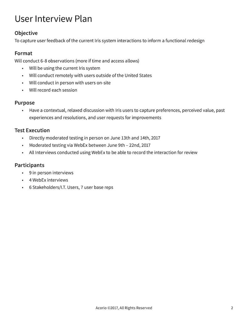
Process
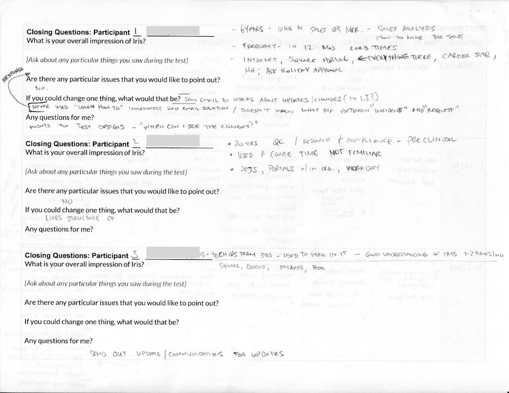
I began by working with J&J stakeholders to understand the product. I then performed two sets of user interviews and user observations with U.S.-based and international employees.It was my intended goal to make recommendations to streamline the ticketing process; however, I found that many employees were not aware of the availability of the product or had a negative relationship with the ticketing application.
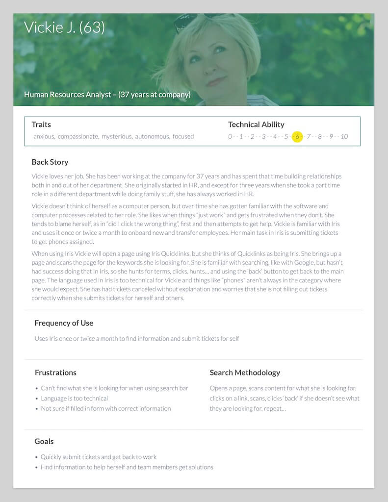
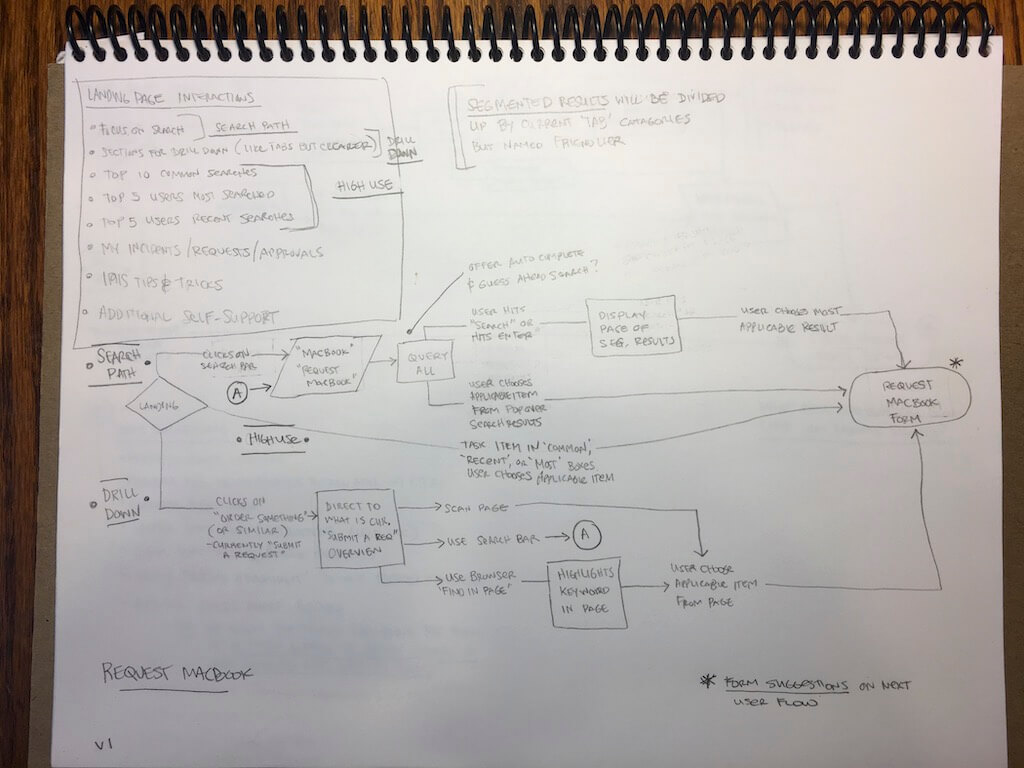
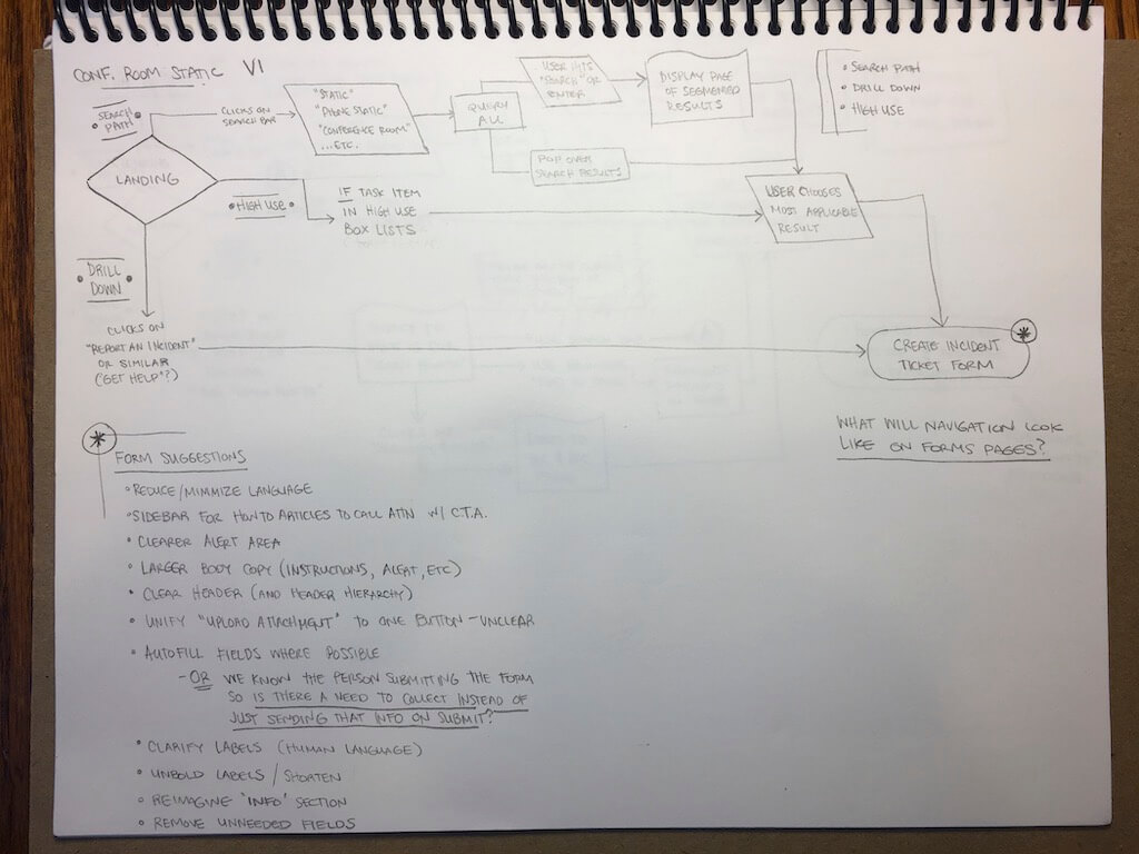
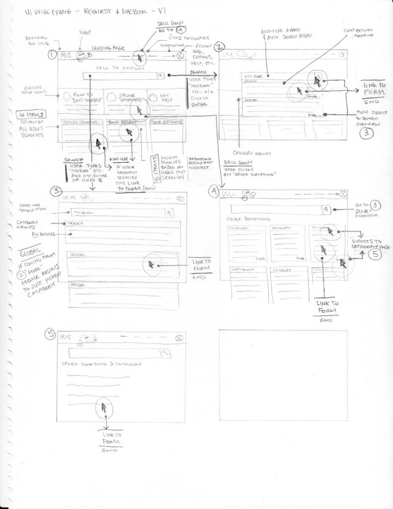
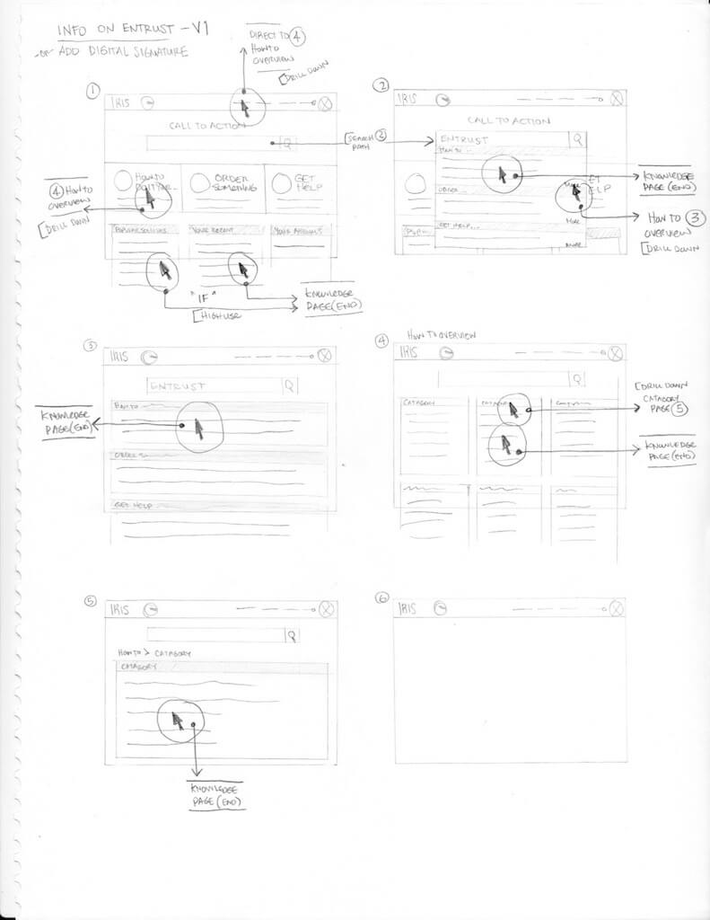
From the interview and observation data, I developed a persona deck representing user types. I think documented existing user flows for the ticking creation process. This allowed me to refine user flows, recommending an improved process.
After vetting the user flows with the technical team and the stakeholders, I created wireframes and prototypes to test my assumptions.
- User Flows
- Sketches
- Wireframes
- Prototypes
- User Testing
Findings
User Interviews
- Normalize Language (human language, not technical)
- Remove unnecessary fields from forms
- Autofill inputs where possible
- Add in valid form validation and clear human language when items do not validate
- If the goal is to get base users to support themselves first, channel users to learning first, or visually prioritize learning ahead of tickets, chat, and the phone number
- Going to need to do some type of rollout notification prior to the changes
- An Iris onboarding overlay/support would help for both new and infrequent users and make it sexy and interesting so people pay attention
- Clear alerts/change logs on main page when items do change/move
- Top 5/10 items searched by individual users widget
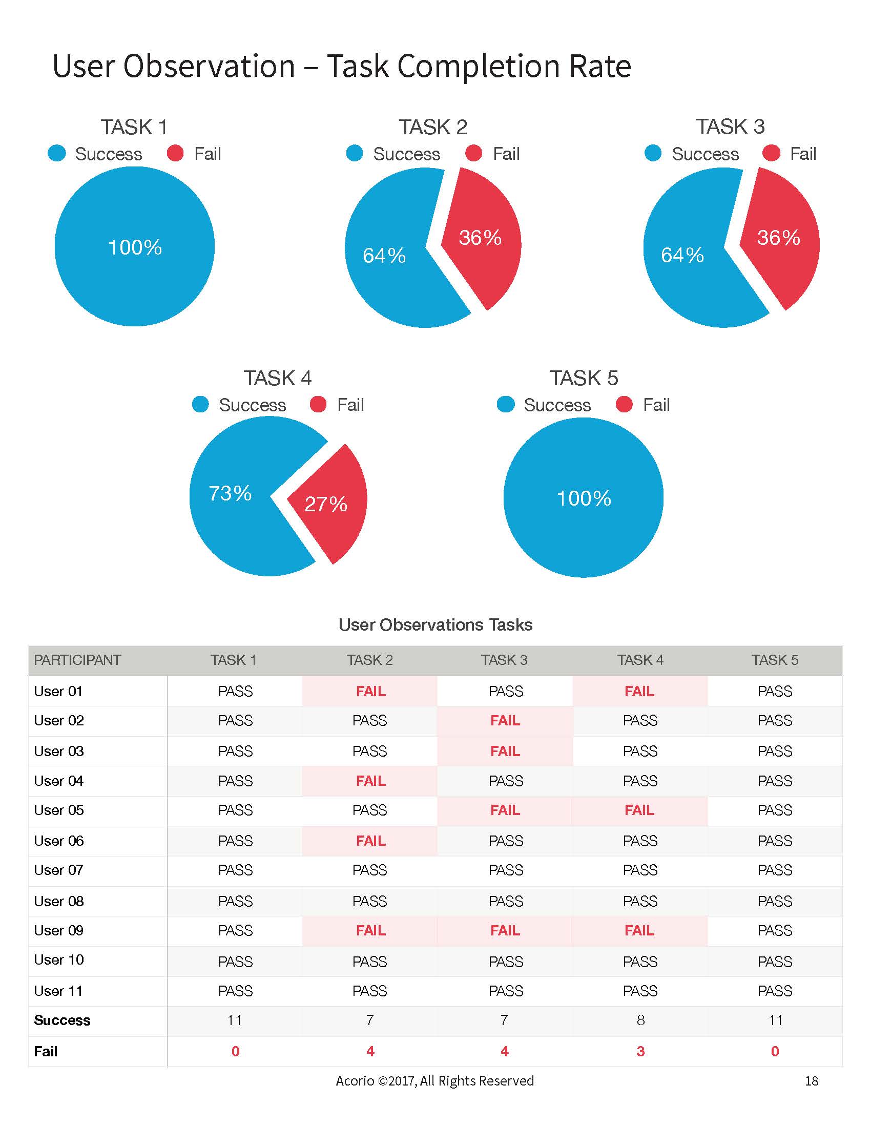
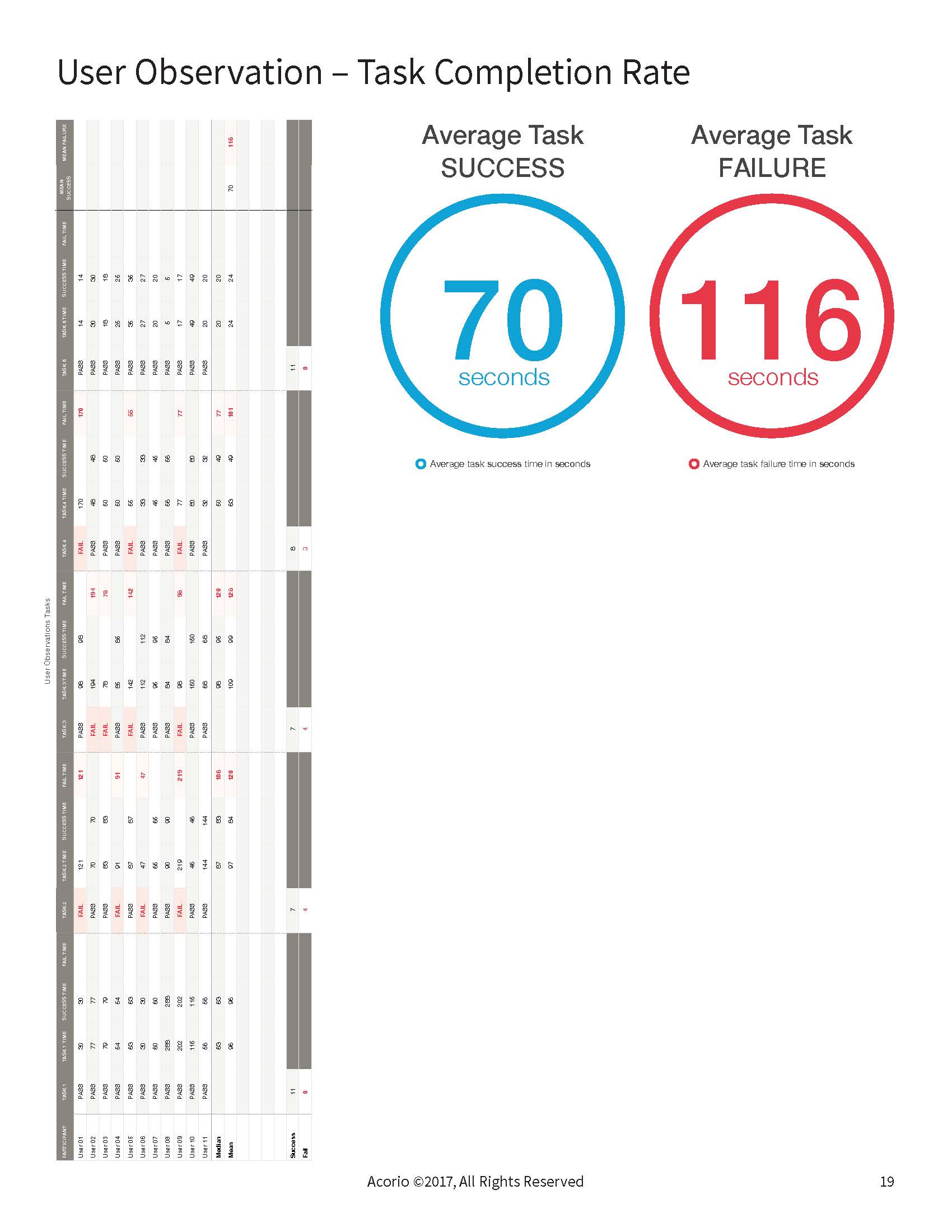
User Observations
- Users say they are familiar with the system, but we saw a lot of hunt and peck methodology in finding what the user is searching for
- A few users noted that they have never used the “Learn How To” section; some mentioned that it was because they were not aware of it
- Two people of the eleven observed used the search bar(s); one people was using questions to search with and not finding results
- Only one user used the ‘Find in Page’ feature built in to every browser to find terms on the page
- Update search bar(s) to be a unified bar that does weighted contextual searches
- Give users some training on how to find things in Iris, giving priority to the learning catalogue
- Consider the use and color of the tabbed browsing; most users observed did not use them and stayed on ‘Submit a Request’ landing page/tab through each task
User Quotes
- “They don’t understand what I’m trying to say” – speaking of Support staff
- “I’m never sure where it might be” – speaking of an item or category in the Iris system
- “I use the QuickLaunch all the time and love it”
- “There are too many choices” – speaking to amount of categories and items
- “There is room for improvement“ – speaking to the entire Iris system
- “I would appreciate a real person“ – speaking in context of the Iris robot icon
- “When I’m mad at the system I call it ISIS”
- “I’m the type of person who is not always confident that it is right, so I’ll call I.T.“ – speaking on unclear listing and catalogue items
- “I always start using Iris here; it is easy for me” – speaking to QuickLaunch
- “This isn’t intuitive” – speaking to the entire Iris system
- “This is a verbose overview of what I’m supposed to do” – speaking to the excessive language of the Learn How To documentation
Solution
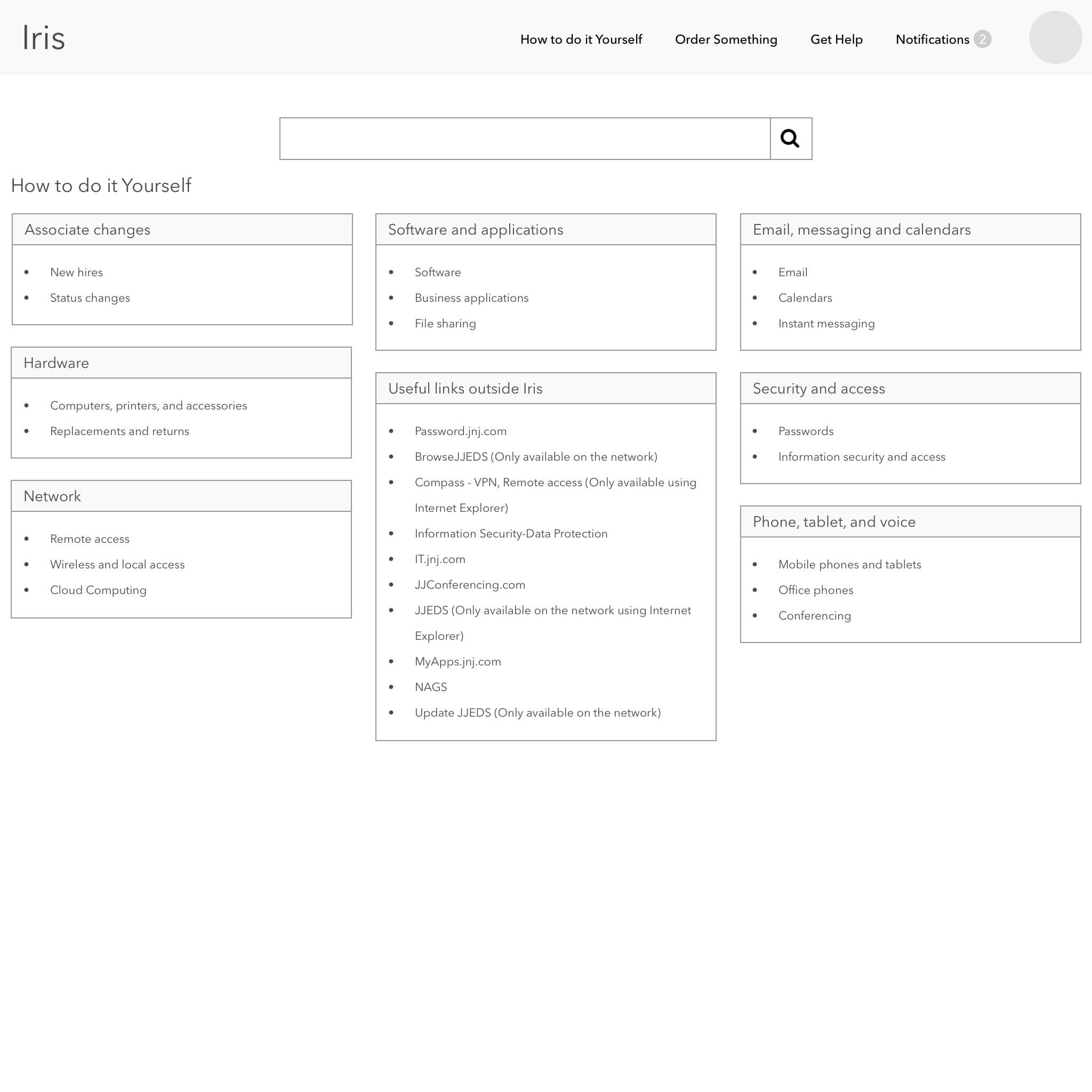
I created and vetted improved user flows that would be more user-friendly, direct users to use the self-service documentation, and empower users to find solutions before contacting the support team. I created refined user flows to improve ticket times and improve self-service. I developed and tested an updated wireframe prototype concept with users.
Impact
Results
Future version of the Iris self-service portal would be more usable and direct users towards a self-service path. Long forms were recommended to be reduced to only necessary information.
Achievements
- Captured a detailed understanding of what users are looking for in a ticketing system
- Increased awareness of self-support
- Recommended a streamlined user flow to reduce time to report an issue
- Recommended uniform design patterns to increase usability of UI
Takeaways
What would I do differently?
One of the difficulties I encountered on this project was that the team I was working with did not fully realize the UX process and saw my role as recommending visual UI improvements and redesigning the product page by page. I compromised in my UX process, providing high-fidelity visual representations to satisfy the stakeholder while still doing the right thing for the UX process in the background.
If I could do this project again, while I was a strong advocate for the UX process during my engagement, I would have sat down with the stakeholder in the first week and asked for explicit expectations.
How did I grow?
For future client contracts, in every kickoff meeting, I explicitly outline what services I would provide paired with visual representations of each deliverable. This was to set expectations at the beginning of the project. Then in each weekly demonstration, I closed each meeting by stating the tasks I would be performing the following week and asking the client if what I was showing was what they were expecting to see and if they saw value in what I was providing. This way, I collected stakeholder buy-in weekly, allowing me to address potential issues in real-time and pivot when necessary.
