Point of Sale
Yum! Brands
Supporting team members in the creation of a POS tool
Overview
Yum! Brands was building a next-generation Point of Sale (POS) system in partnership with Taco Bell. I was mentoring the Yum! mid-level UX Designer who was working on the POS team. I worked with the team member to review their work and provided feedback. When it came time to start user testing, we worked together to create the task list users would perform.
Role
UX Designer
Scope
Six Weeks
Tools
Research, Documentation, User Testing, Sketching, Sketch, Axure
Approach
Problem Statement
A team member needed support reviewing work, providing feedback, planning to test, building an advanced prototype, and running and reporting on user tests.
Goals
- Mentor and guide a mid-level UX Design team member
- Create realistic prototypes for testing
- Capture feedback to refine the next-gen POS product
Process
For this project, I was mentoring a Yum! mid-level UX team member who was working on the POS team. I worked with the team member to review their work and provided feedback. When it came time to start user testing, we worked together to create the task list users would perform.
Because I had more experience with Axure, I was asked to create the prototype. Additionally, I ran the first two rounds of user testing and worked with the UX team member to review the results.
Throughout reporting, I made recommendations to improve and normalize patterns, establish a grid for the UI, and clarify interactions. I then updated the prototype and handed it off to the Yum team member for additional rounds of testing.
- Mentorship
- Sketches
- Mockups
- Prototypes
- User Testing
- Recommendations & Iteration
Findings
Round One Testing
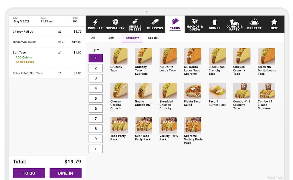
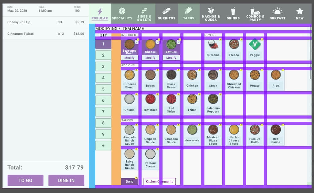
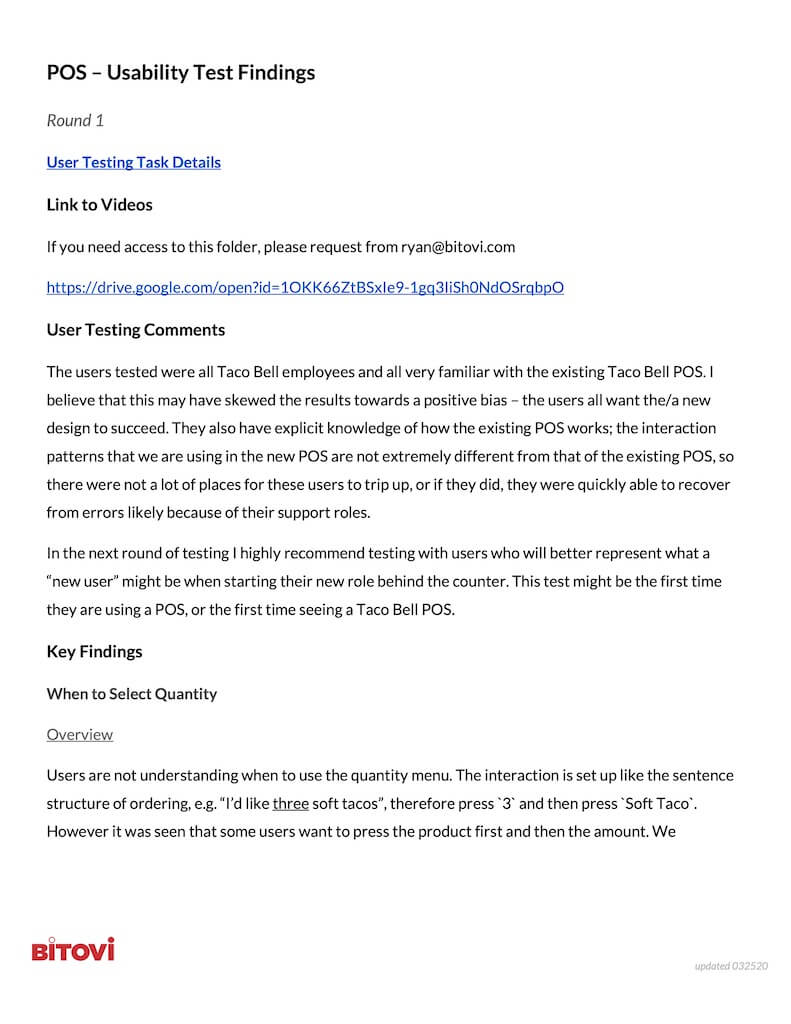
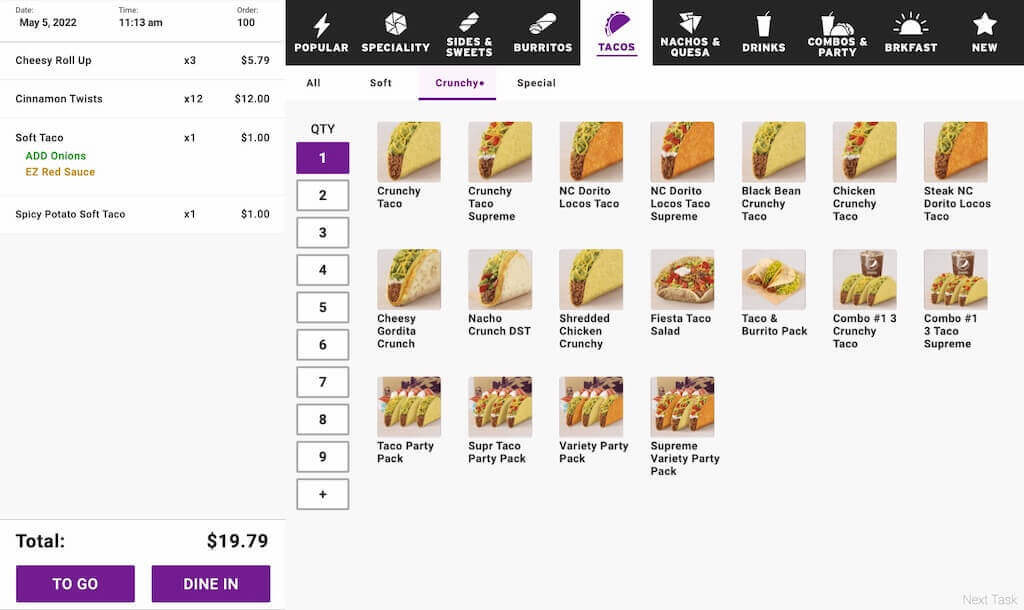
- The 'Quantity' menu was unclear to users – users are familiar with selecting quantity first, then product, much like the sentence structure of ordering, e.g., "I'd like three soft tacos"
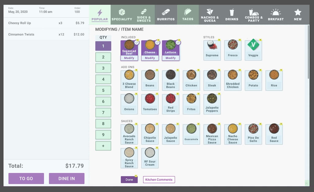
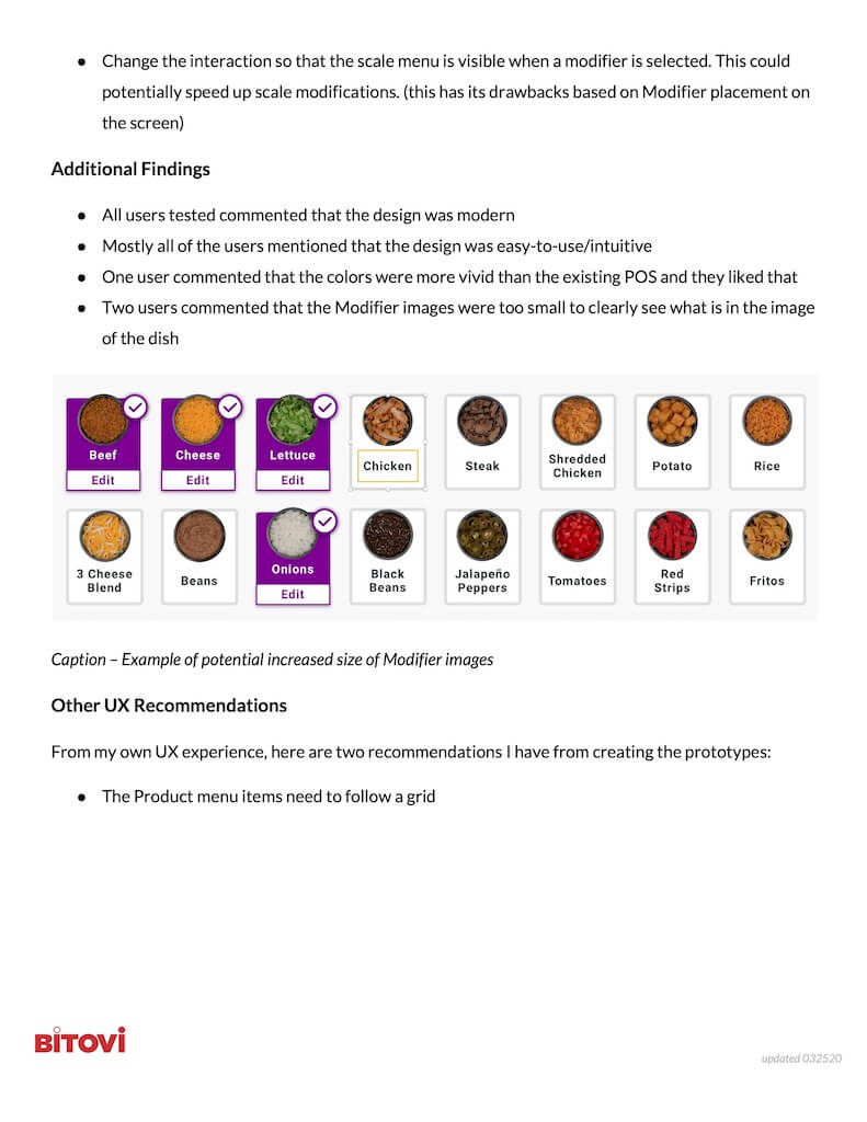
- The 'Edit' interaction on an active modifier was being overlooked. I recommended increasing the label and the size of the button to make it more noticeable
- All users tested commented that the design was modern
- Mostly all of the users mentioned that the concept was easy-to-use and intuitive
- One user commented that the colors were more vivid than the existing POS and they liked that
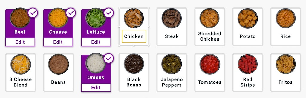
- Two users commented that the Modifier images were too small to clearly see what was in the photo
Round Two Testing
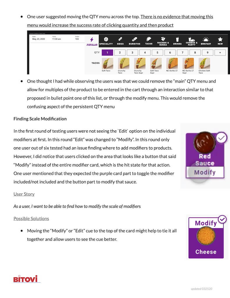
- Updates to the quantity menu pattern still unclear to users. I recommend adding a signifier to call additional focus
- Refinements to the 'Edit' menu were successful at a rate of 86%
- No users mentioned that the modifier card images were too small in this round
- Mostly all of the users mentioned that the design was easy-to-use/intuitive
- Many of the users mentioned the similarity to the Taco Bell kiosk application
Solution
While building and observing the prototype, I noticed a potential issue with the Modifiers menu when items will have many modifiers. For the mental model for the user, it is important to keep interactions (meaning the modifier cards) in the same location from page to page. Meaning "Jalapeno Slices" should be in the same location on the screen for all places that those would be a modifier option. This can be relative to product types as well, meaning Jalapeno Slices are in one location for tacos/burritos and a different place for nachos.
In the existing design concept, the "included" section on the modifier list keeps the modifier cards moving from product to product. A new concept would require keeping the cards in the main list and displaying them in an "included" list. In this proposed layout, we can expose the modifier scale to the top-level menu rather than rely on a modal menu for modification.
Impact
Results
The new Yum Point of Sale system is currently rolled out in over 400 Taco Bell stores and expanding. While I can't take credit for the design of the POS, many of the recommendations I made are in the interaction design.
I empowered team member to do their best work. I enjoyed watching them grow, and they have recently become a senior-level UX designer in their newest role. Their hard work paid off, and I was proud to be part of their journey.
Achievements
- Made recommendations to normalize interaction patterns
- Created and iterated advanced Axure prototypes
- Ran user testing with Taco Bell team members
- Reported on feedback and made recommendations on improvements based on user feedback
Takeaways
What would I do differently?
The one thing I would have done differently on this project is that I should have worked in parallel with the UX team member instead of taking full ownership of creating the prototypes. This would have helped improve their abilities within Axure and included them in the build of the advanced prototype. Having the team member work alongside me as I built the prototype would have helped avoid the difficult handoff after I no longer supported the project.
How did I grow?
This project allowed me to continue to mentor others. I am a teacher by nature. I have mentored other UX professionals in their careers. I enjoy educating others, and I want to help others get to a better place than they were before.
This project also allowed me to create an advanced, nested Axure prototype. I have worked with Axure for over 15 years. However, there is always something new (or to refamiliarize yourself with) in Axure.
