Menu Management Tool
Yum! Brands
Creating a menu tool for Pizza Hut, Taco Bell, & KFC
Overview
I joined the Yum! team as a consultant in the role of Product Owner and UX Specialist for an enterprise menu management tool (MMT). The MMT's purpose is to create products, pricing, taxes, store information, combo deals, and more for the Yum! Brands Taco Bell, KFC, and Pizza Hut.
Each of the brands, Taco Bell, Pizza Hut, and KFC had its own legacy MMTs, glossaries, and processes for updating data. It was essential to observe and research how each brand was accomplishing tasks, listen to users' and multiple stakeholders' needs, and recommend solutions that work across all brands.
Role
Product Owner & UX Designer
Scope
Two years
Tools
Research, Observation, Workshops, Documentation, Presentation, User Testing, Sketching, Figma, Axure, Zeplin
Approach
Problem Statement
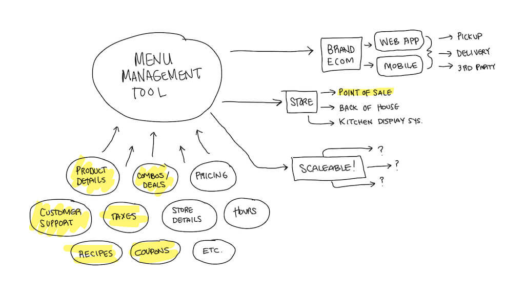
Create a single tool to manage all of the data that make up products, menus, discounts, pricing, taxes, store information, customer support, etc. for all US KFC, Pizza Hut, and Taco Bell locations. In later phases, the MMT will be rolled out internationally.
Goals
The MMT would be a place for users to create and input all details necessary for a fully functional store and would eventually be a single-source product for many different user types. Each user type would have its purposes and tasks within the product. All of the data within the MMT would feed into brand applications and eCommerce solutions like KFC.com to supply product details, store hours, product information, and pricing by location. This data would flow to stores for back-of-house and point of sale systems.Process
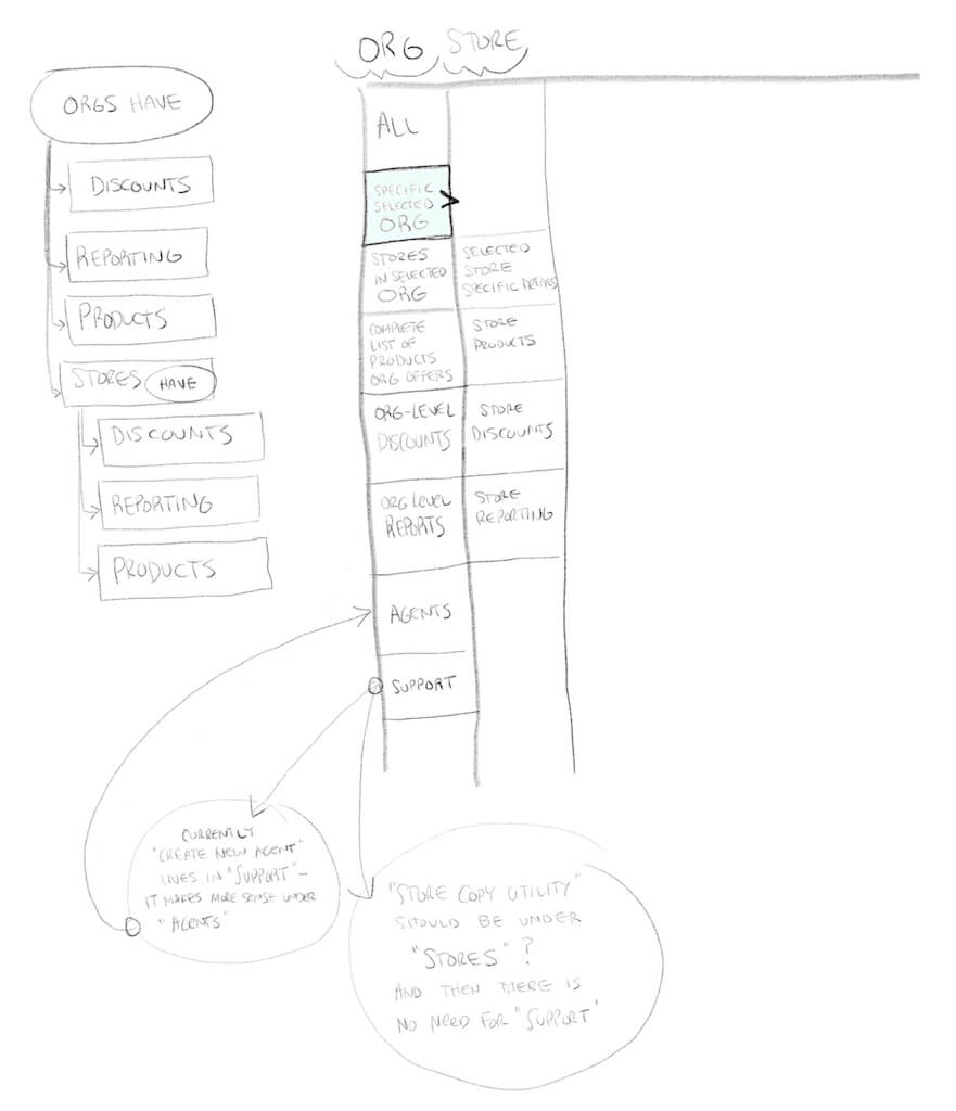
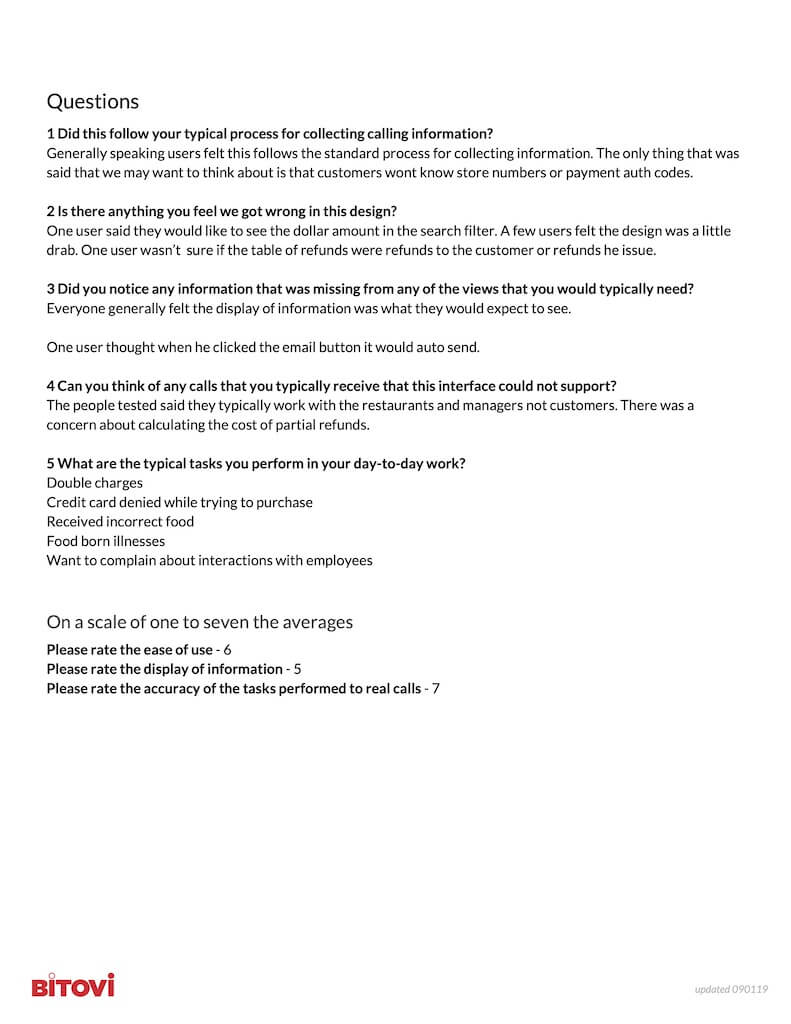
I started this project, like every project, by creating a repository where all documentation will live. There was a lot of information to capture, refine, and establish an understanding of. There were four existing products to review and refine into a single product. I started by familiarizing myself with all of the different MMTs currently in use by Yum! And the brands. I met with and observed our initial primary user focus, Data Managers. I watched multiple Data Managers for each of the brands step through their workflow, asking for clarification as needed. These observations helped to call out pain points and issues around all four systems.
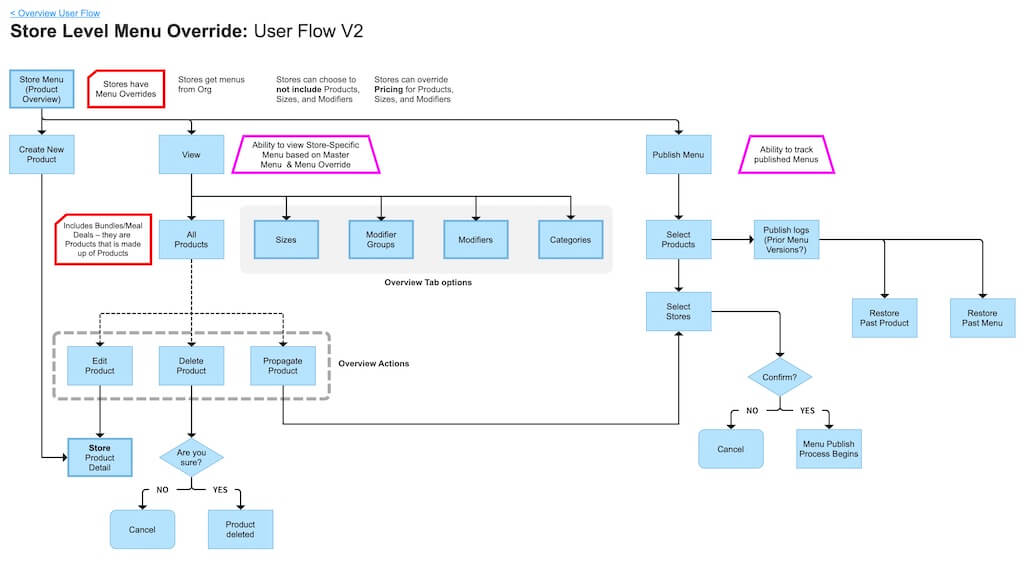
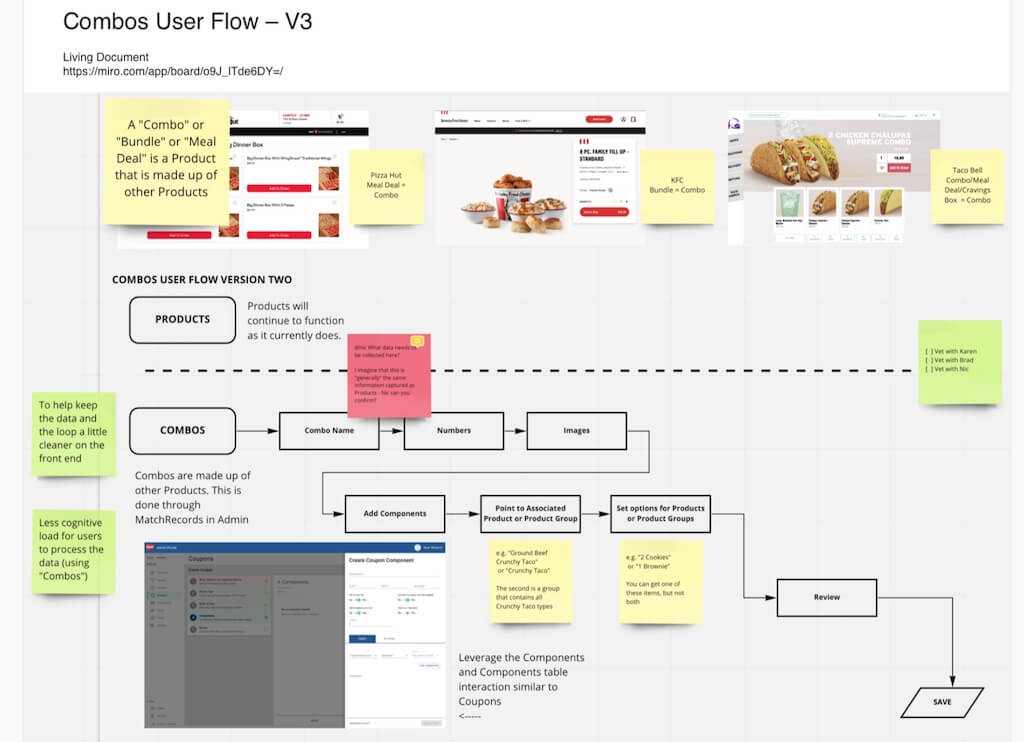
There would be a lot of effort towards modernizing, simplifying, and streamlining flows and processes. I developed a persona deck representing this product's wide range of users. I wrote user stories, groomed tickets with the business analyst, and helped research and define how features would work within the MMT. I created and refined used flows and worked with devs to vet concepts to align on "when" and "how" to build features.
I ran workshops with stakeholders from Yum! and the three brands. I collaborated with stakeholders and other POs to create and align project timelines. The focus of my work was to define requirements and conceptualize a single product that would accommodate the needs of multiple users and different use cases, satisfy the needs of all of the brands, and support the implementation of the product.
I helped align expectations for my team and across pods. I called out gaps and helped format sprint planning. I worked with the team, stakeholders, and other POs to drive goals, set feature timelines, and outline requirements for features, interactions, and refinements.
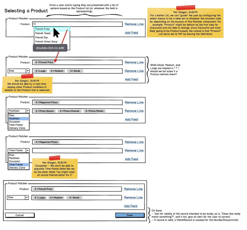
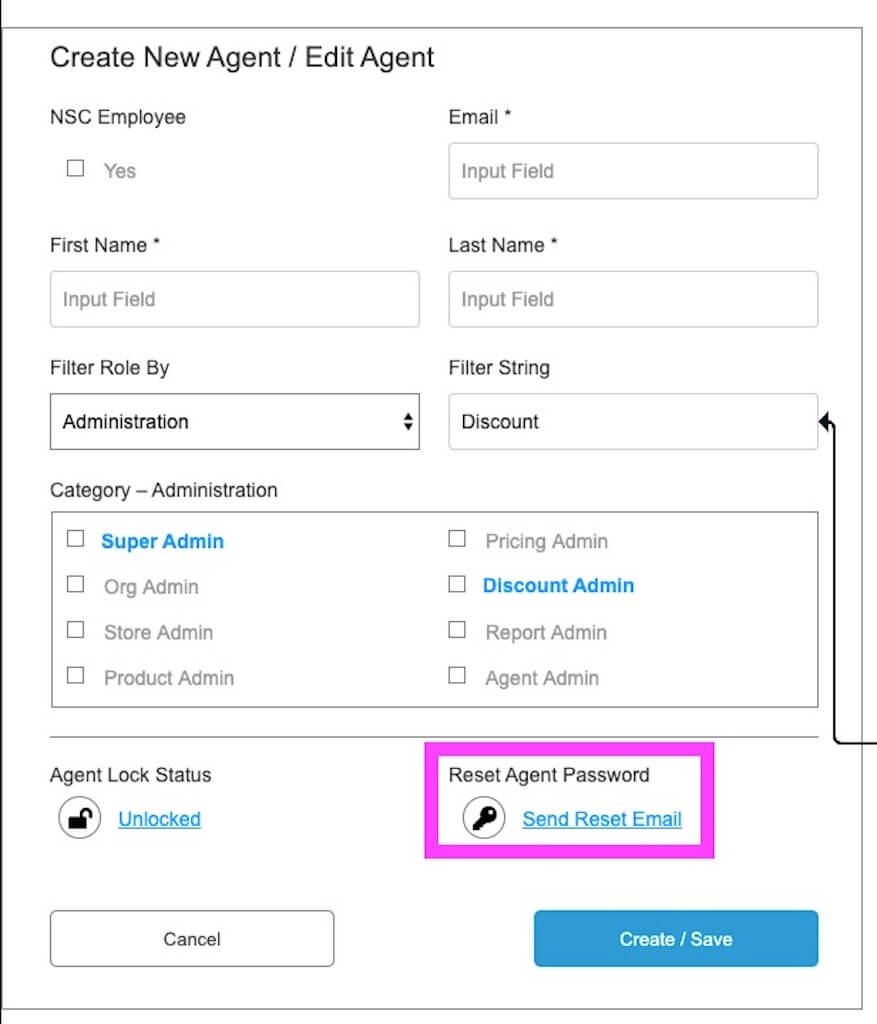
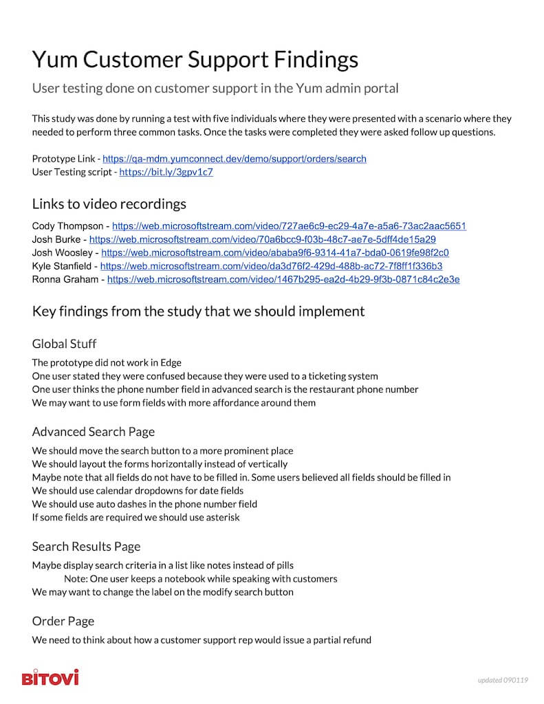
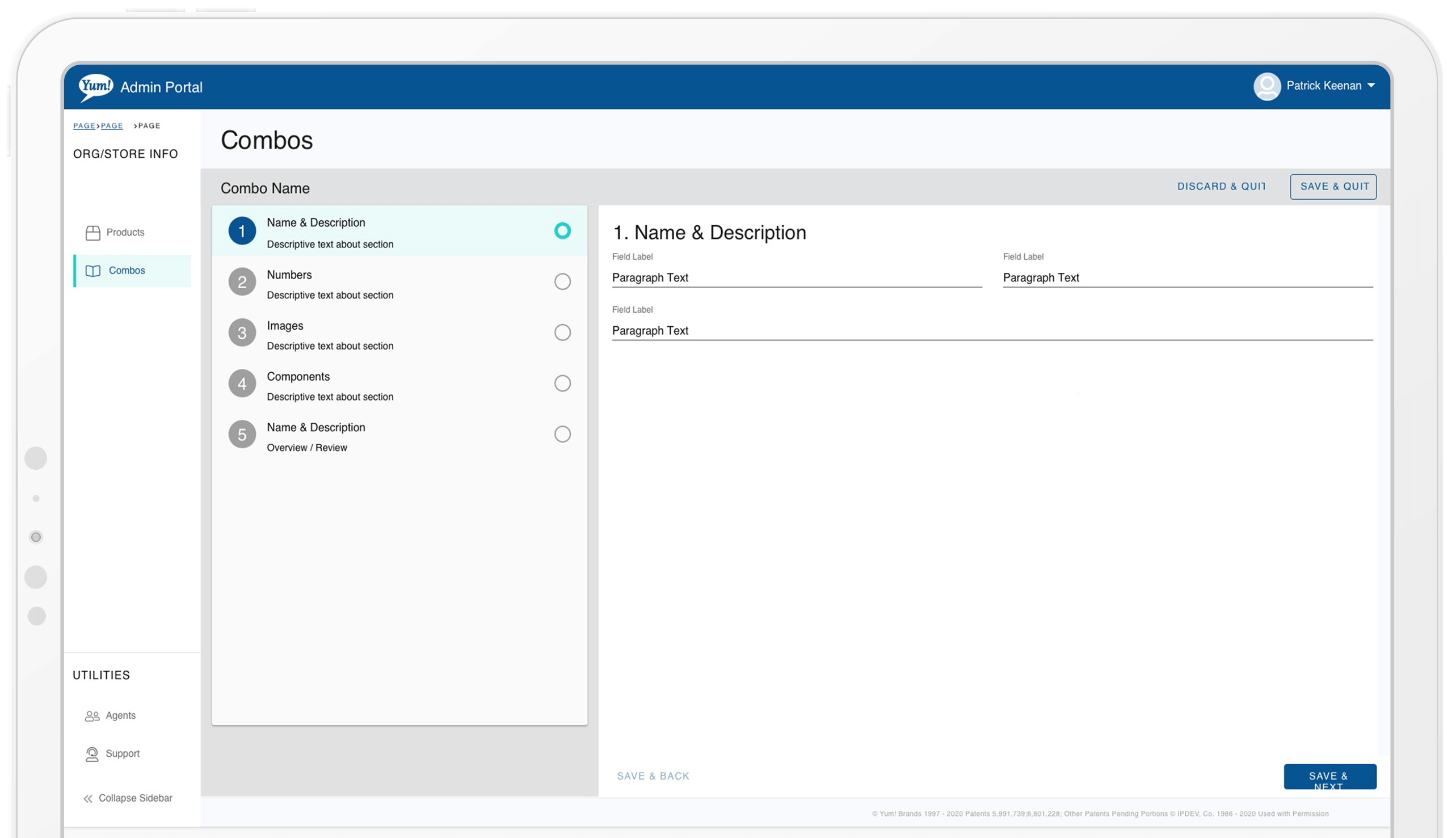
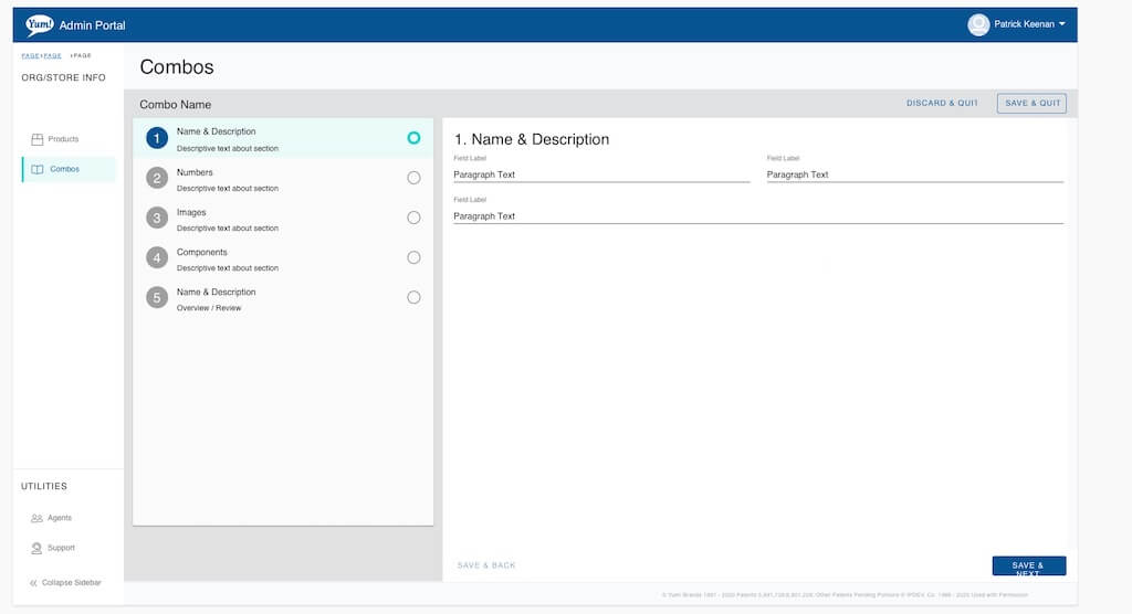
Using Material UI as our library, I developed common UI patterns and created wireframes for developers to reference and build from. I planned, performed, and reported on user testing. And I QA'd builds to ensure that the proposed designs were implemented as expected.
- User Flows
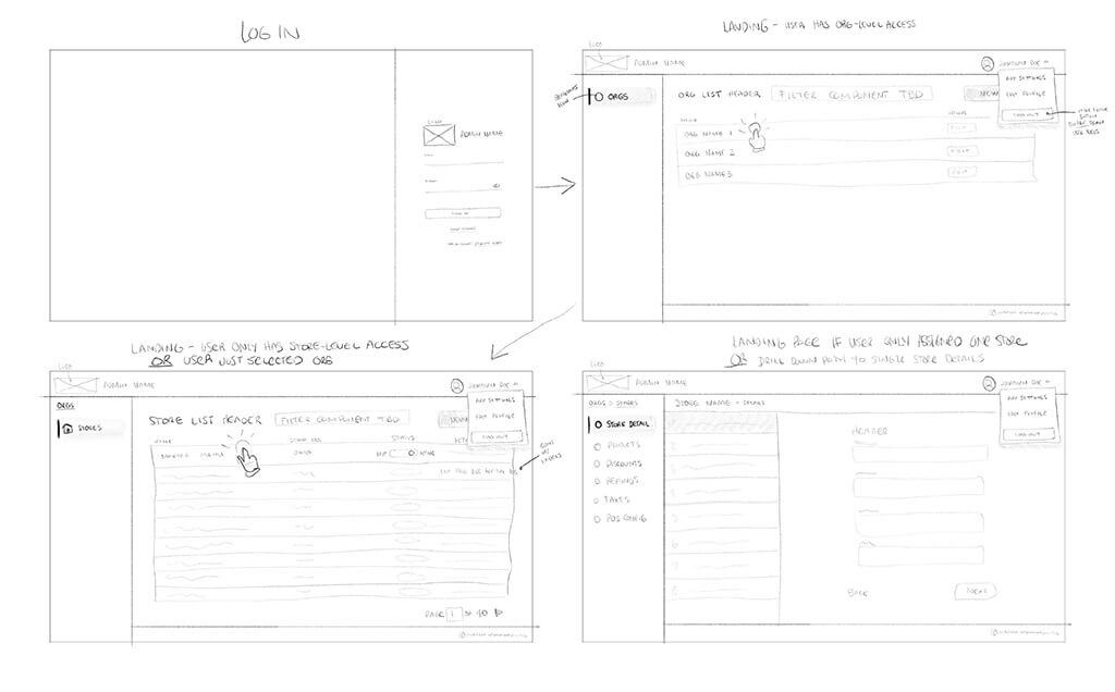
- Sketches
- Wireframes
- Design System
- Mockups
- Prototypes
- User Testing
- Iteration & Refinement
Solution
Many of the MMT features I created are in production for the three brands and have solved the goals of simplifying a previously complex process, reducing team member onboarding time, and unifying the process across brands. The product continues to scale with the needs of the stakeholders and users.
Impact
Results
- Worked with stakeholders across multiple brands to help to define feature timelines for the MMT product
- Created documentation to live as a central source of truth and support project onboarding
- Defined initial interface patterns for MMT product
- Assisted in sprint planning, writing user stories, and pulling together resources for issues
- Worked alongside stakeholders, BA’s, Tech Leads, POs, and Developers to define and align project needs
- Researched, ideated, and iterated through features with stakeholders, vetted with developers and users
- Developed concepts for the complex Tax Logic Builder feature Helped to build & mentor Yum.dev’s UX team
- Helped Bitovi create a lasting relationship with Yum
Achievements
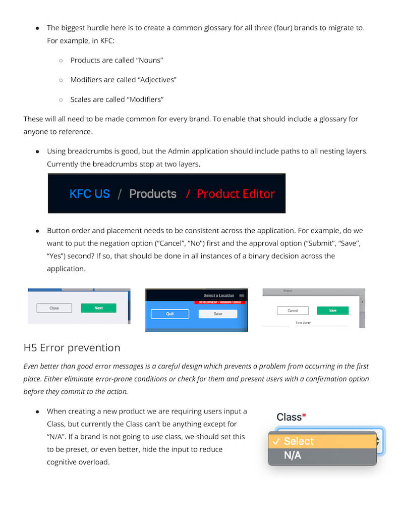
My impact on the Yum MMT project and related projects were numerous. I helped major brands to come together to speak the same language and agree on adopting new and improved processes for maintaining their menus, products, pricing, store information, and customer service support that will continue to function and grow into the future.- I helped to imagine a single-source product for all brands to update menus, products, deals, coupons, store details, and depletion information
- I defined and improved user flows through the system
- I helped to create a single location for cross-brand customer support
Takeaways
What would I do differently?
Based on developer preference, we based the UI elements of the product on the Material UI package. Material UI is fine, but I feel that our pattern design was limited. If I could do this again, I would have recommended using TailwindCSS. Tailwind would have provided more flexibility in our patterns and design elements over time.
How did I grow?
The thing that I took away from this project is the value of living in a state of uncertainty. This project was massive, and there was lots of information to capture, understand, and organize. Connections between concepts were not always apparent in the short term.
In my career, I've frequently had stakeholders tell me that their product "was for everyone." The Yum! MMT was the first project where I can recall that being true. It was essential to understand all potential user types, the tasks they would perform, and what interaction patterns are available across each scenario. Having an organized design system was necessary to align the team on solutions.
