Build v. Buy Discovery
Kroger
Replacing software that intakes 28B worth of product, yearly
Overview
My focus for this project was to make a recommendation for replacing a piece of 35+-year-old software called ChainTrack. ChainTrack is used across the enterprise for receiving certain types of products through the docks at Kroger stores, a process called Direct Store Delivery, or DSD, where products like Coke, Fritos, and alcohol come into the store. Kroger DSD intakes ~28 Billion dollars of products using this software.
Working with a Product Manager and Tech Lead, my team was to research and understand enough to be able to recommend building our own or purchasing a replacement product.
Role
Product Designer
Scope
Eight weeks
Tools
Axure, Sketch, Documentation
Approach
Problem Statement
The problem I needed to solve was how to replace an antiquated piece of technology with something more robust. One of the business requirements was that the replacement product needs to be able to exist on TC-52 Zebra devices so that Kroger is only maintaining a single device type across all stores.
The next iteration of this product must:
- Make data more accessible
- Reduce printing and invoice storage costs
- Support DSD Receivers to intake products at a lower cost
Goals
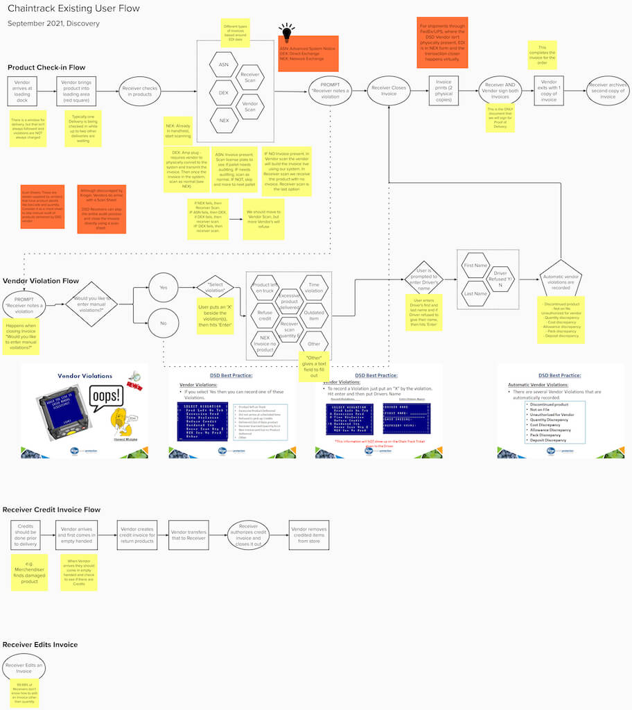
- To understand and document the existing DSD Receiving process and use of the ChainTrack product
- Run observations and workshops with my team, stakeholders, and software vendors to collect information
- To conceptualize what would be needed in a replacement product
- Evaluate competitor products that could function as a replacement
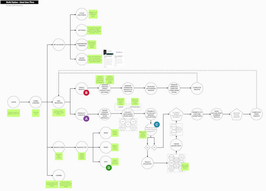
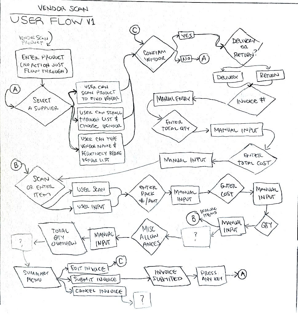
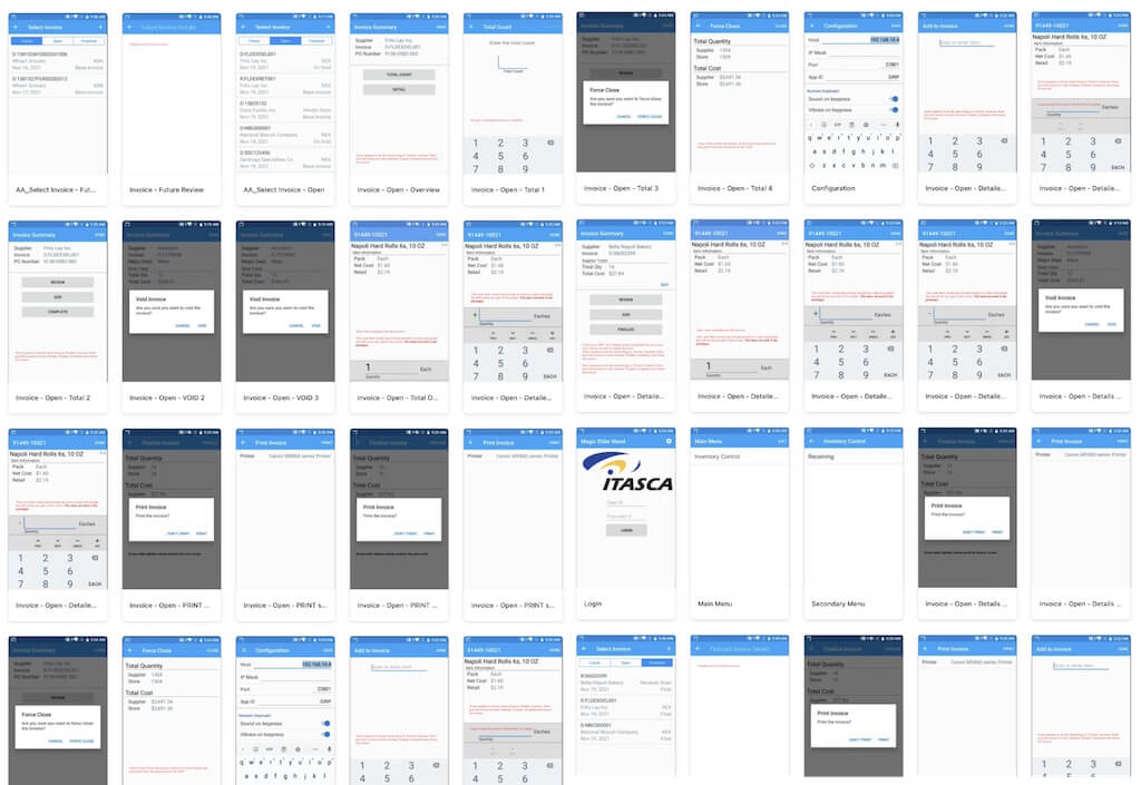
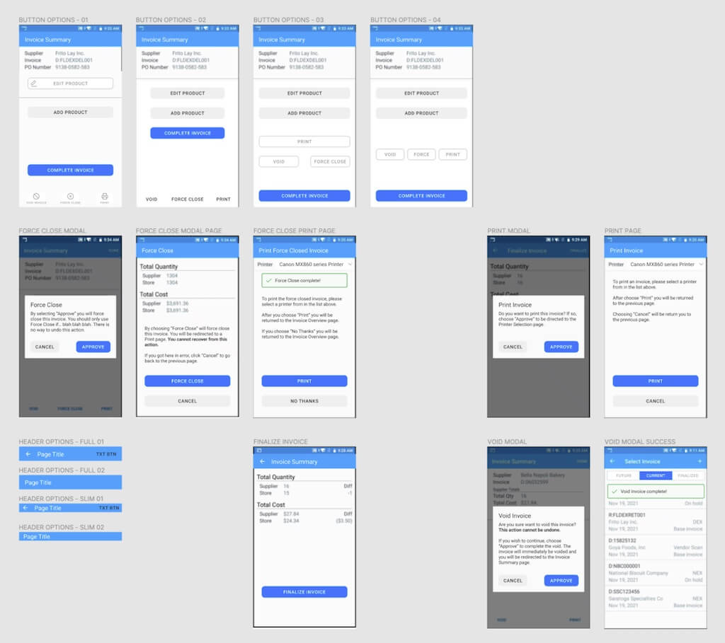
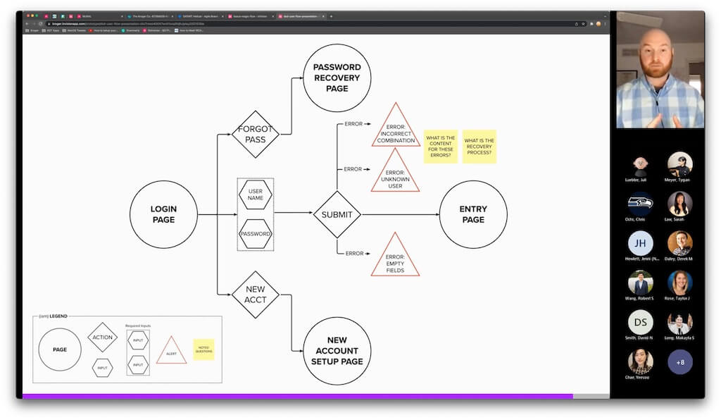
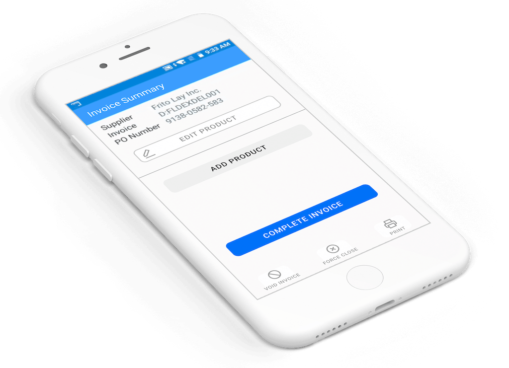
- Create and visualize concepts like feature timelines, user flows, existing state click-through prototypes, and other deliverables to share with others and support a build or buy decision
- Support change management
Process
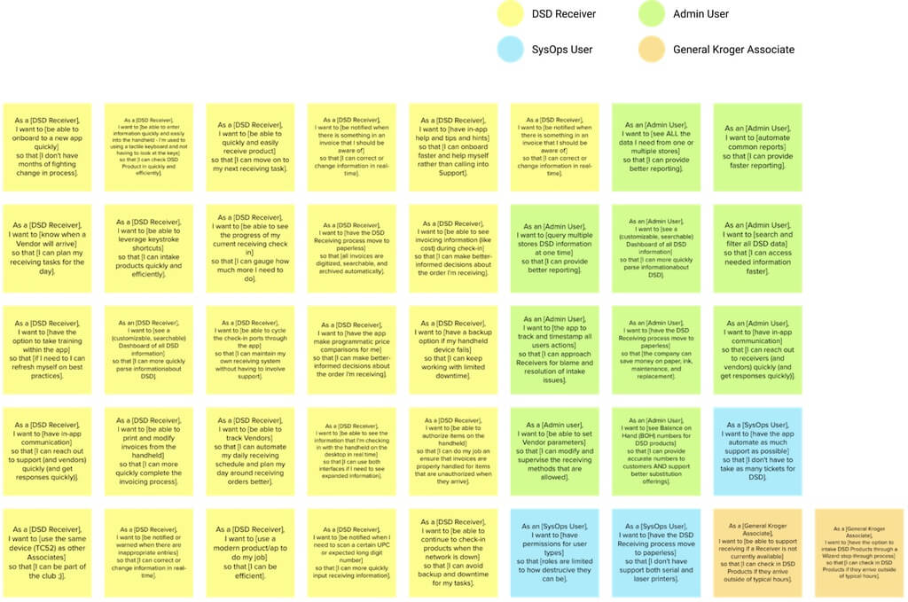
Going into the project, I had no experience with product receiving or the DSD process. I began the project by researching the DSD process to understand the DSD Receiver and identify secondary users. Through a survey, I captured the needs and pain points of users, trainers, and managers within the DSD space.
I led my team in in-store observations to see DSD Receivers' intake products and interact with the ChainTrack product in their environment.
- User Observations
- User Flows
- Sketches
- Wireframes
- Prototypes
- User Testing
Findings
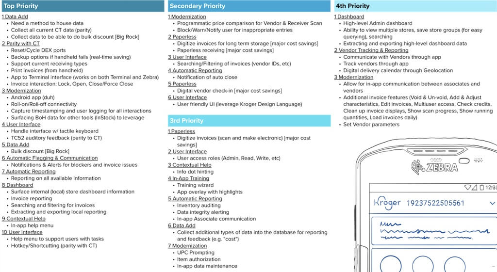
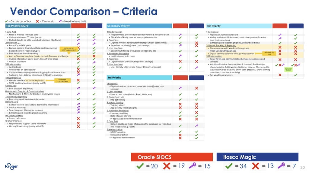
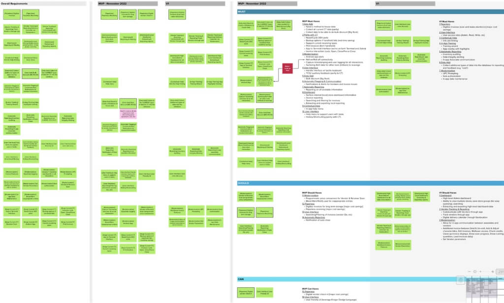
Once I understood ChainTrack and the DSD process, I ran a workshop with my team to vet the order of priority for the business and user requirements for a build or buy replacement recommendation. I created a phased feature timeline and a vendor report card from this activity. Items we listed as Top Priority were parity with ChainTrack, ways to improve the user experience, and solve business goals that cannot be achieved with the current product. I used the vendor report card in meetings with software vendors to assess their software solutions against Kroger's requirements.
Solution
Not only was there a clear path for which company to move forwards with, but the software provider we recommended voiced interest in finding solutions to many of our requirements, asked for clarity around others, and offered to build the solutions we needed throughout our partnership.
If Kroger is going to build a product itself, there needs to be a clear industry differentiator. It was obvious to myself and the team that there was no clear differentiator in building our own solution. Additionally, over at least five years, partnering with the vendor would be less expensive and more rewarding for Kroger and the users than if we were to build the product ourselves.
Impact
Results
I supported the creation of my team's presentation deck. There were six slides to present and ~150 slides representing my research in the appendix. We presented our findings to a panel of Kroger VPs. Our buy recommendation was approved by the VPs of Kroger Digital Technologies, noting the amount of research and documentation I provided trust in our decision.
Achievements
- My work for this project provided a wealth of research that supported our recommendation to buy a third-party replacement
- I advocated for the UX process throughout the project
- I facilitated workshops with my team and cross-teams to capture information and helped to align our understanding
- I worked alongside the software provider to ideate and iterate through user flows and prototypes of their product which vetted the product, called out errors, and highlighted gaps in product flow
Takeaways
What would I do differently?
If I could do this project again, I would have pushed harder to shorten the eight-week timeline to four weeks. The team had ~85% confidence in our direction by the end of week three. The remaining five weeks allowed us to meet with more users, capture additional information, and iterate through requirements. This extra time was beneficial in adding to the materials that helped to green-light the project. Still, a shorter timeline would have allowed the contract process to begin sooner, allowing the team to move to the next project phase more quickly.
How did I grow?
This project introduced me to a new industry, Direct Store Delivery. Going into the project without prior knowledge helped me approach solutions from a fresh perspective while still applying my understanding of the UX process.
Another lesson I learned is that, regardless of the size of the business, the industry, type of team, or length of time co-workers have worked in SaaS, I still find that many people don't understand the role of a UXD or PD. What I like about the constant advocacy approach is that there is always room to help others learn and to surprise team members through my transparent process, helping to change the mindset that "designer" = "visual design".
