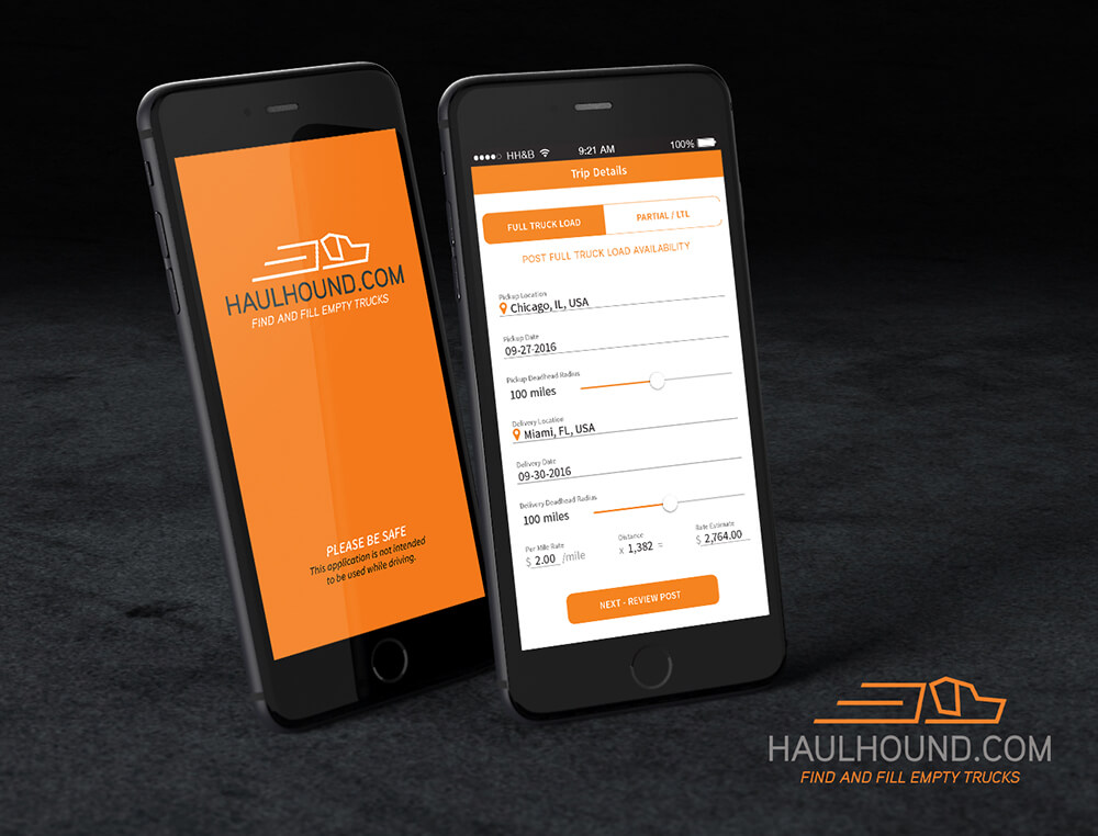
HaulHound
HaulHound
Helping independent truck drivers backfill trailers.
Overview
A client came in with an idea and wanted to create the "Uber for Trucking." The client had a problem he wanted to solve but didn't know where to start. The timeline to conceptualize, build, and launch this product was short. In three months, there would be a trade show where the client wanted to unveil the product and start signing up users.
Role
Product Designer
Scope
Twelve Weeks
Tools
Research, Observation, Documentation, User Testing, Illustrator, Axure, Stache, HTML, LESS
Approach
Problem Statement
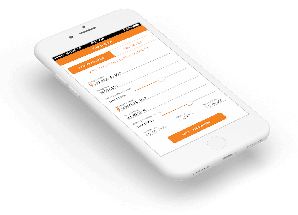
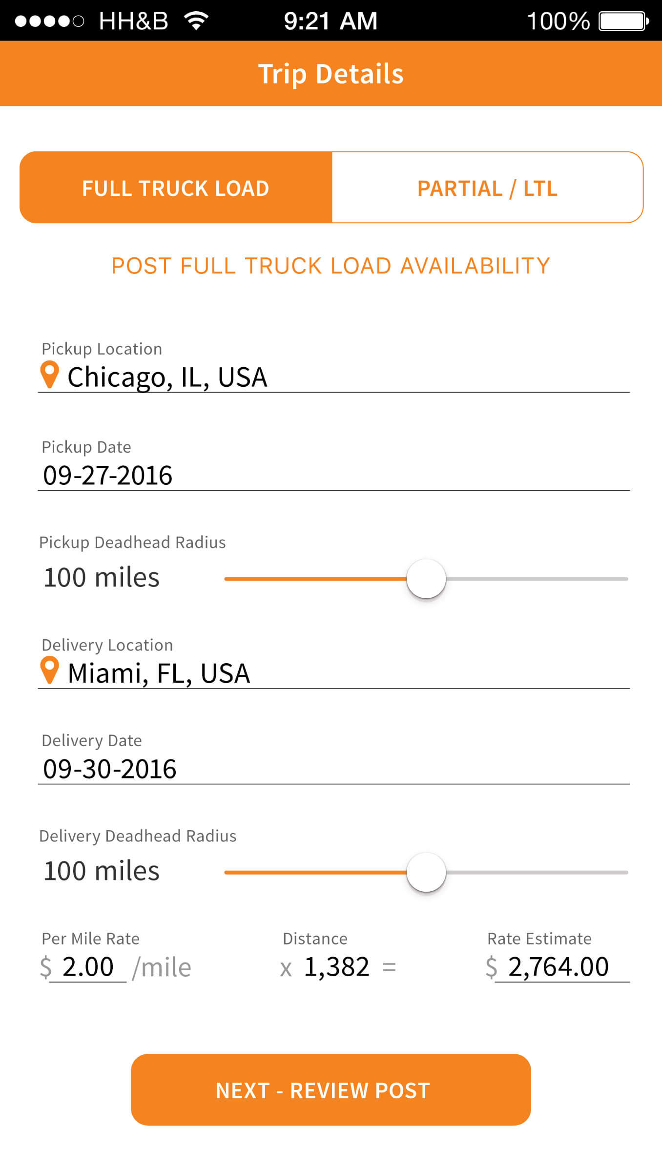
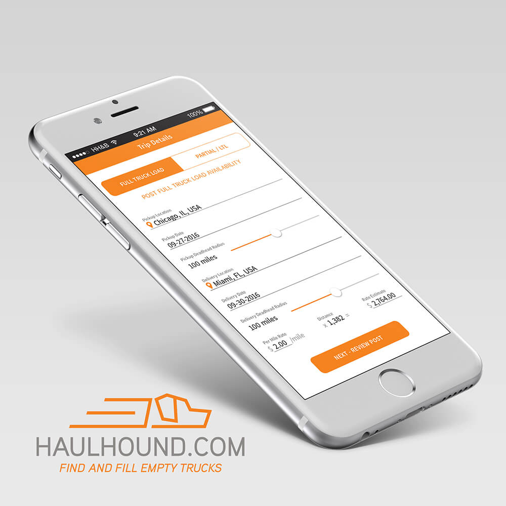
There is a problem in the trucking industry that is specifically painful to independent truckers and small trucking companies. When driving a fully loaded trailer from, for example, Chicago to Dallas, there is no efficient way to book your trailer to be refilled on your return trip to Chicago. Driving an empty trailer, called 'deadheading,' is costly for two reasons; you have to pay for the gas to get back home, and there is no load to deliver and get paid for when you arrive home.
Goals
- Conceptualize a concept that would alleviate pain points for independent truckers
- Have the product in the Google Play and Apple App Store
- Sign up users in-app at an upcoming trade show
- Deliver an MVP in three months
Process
I start all my projects by creating a repository where the project's documentation will live. A single source to keep and update all of the design rationale. This repo always contains a project glossary, including industry definitions of terms and acronyms like 'Deadheading' and 'LTL,' which means less than load. A glossary is always a good way to get team members associated with the project to speak the same language. It also helps when onboarding new team members.
I first had to understand the idea from the stakeholders' point of view and the process and current pain points from the users' perspective. I began the project by spending two full days with the stakeholder, workshopping the concept to capture as much information from his perspective.
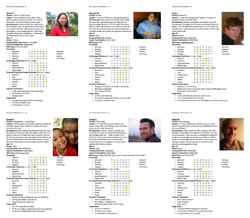
I interviewed eight independent truck drivers and logistics experts to help to understand their process and identify pain points from their point of view. I then developed a deck of six personas representing the types of users for the intended product based on the needs, pain points, and characteristics I observed in speaking with users.
The feedback I captured from the users led to discussions with the stakeholder about adding features we had not considered. For example, I proposed offering a paperless solution because more than half of the users I spoke to commented that drivers don't like how much paper they collect in their cabs from pickups and deliveries.
All of the information I captured allowed me to start to define the product, what features would be needed now and in the future, and how we might approach building those features. Based on my understanding of the product, I drafted scenarios and vetted them with the stakeholder and his trucking industry contacts. I used these scenarios and tasks to communicate to my team to help them better understand what this product would need to do.
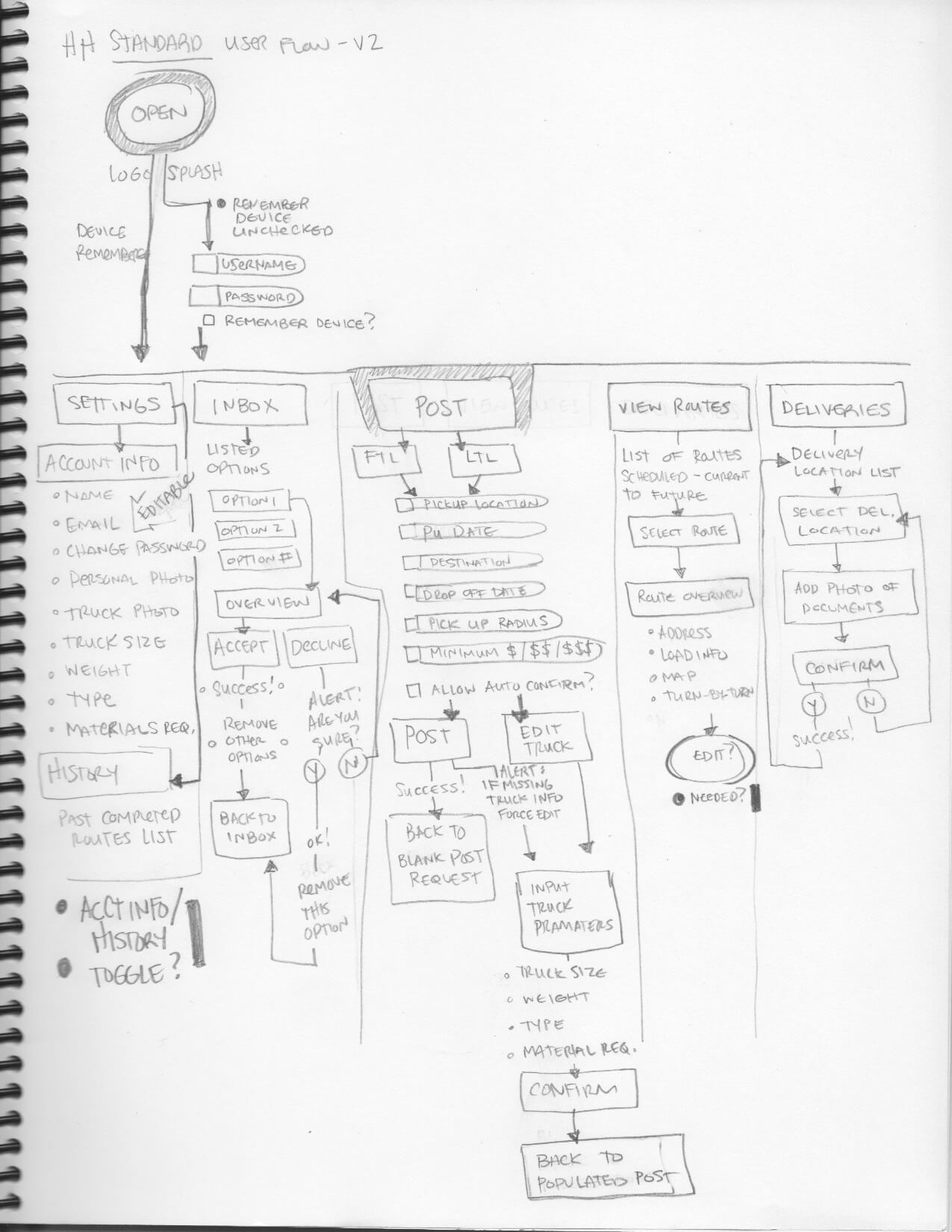
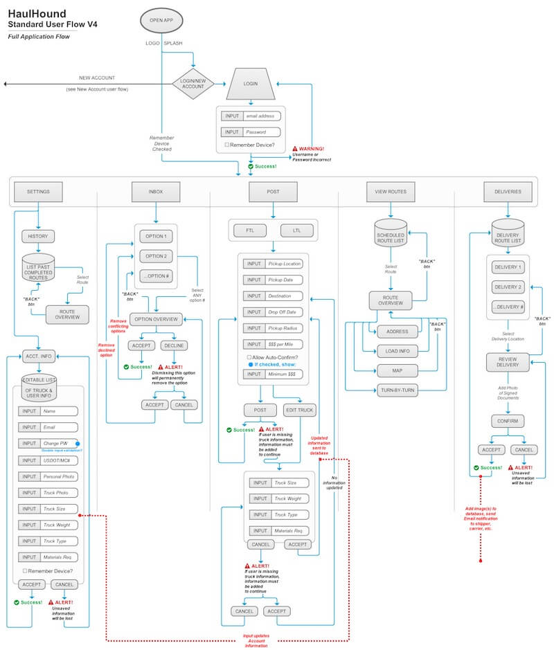
I built out user flows to better understand, refine, and visually communicate how each piece of the product would fit together. Thinking through the user flow allowed me to establish the requirements for the product, which I vetted with the lead dev and stakeholder to ensure everyone was on the same page.
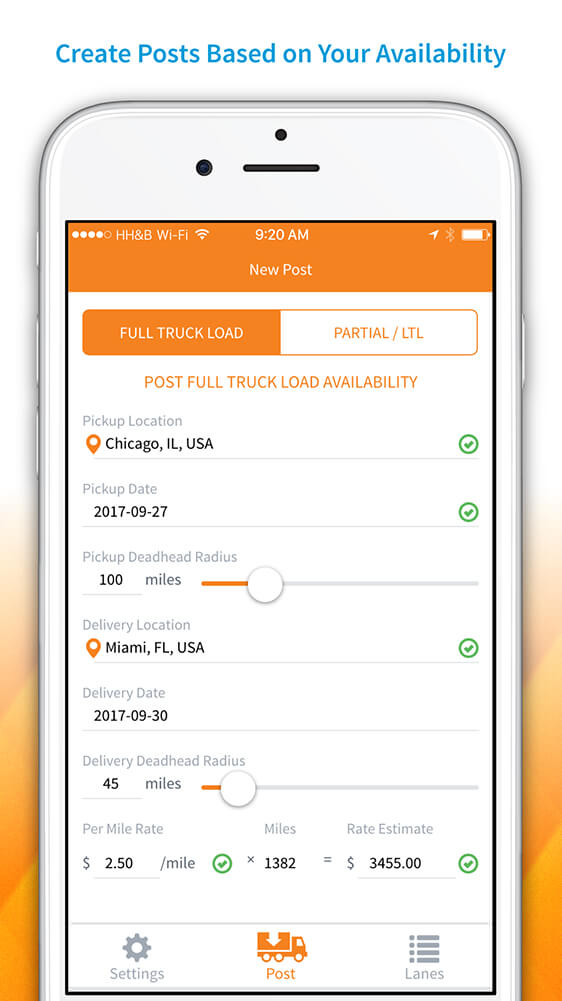
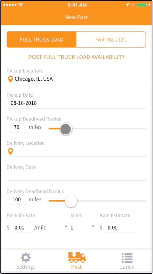
I then started to create mockups. For mockups, I don't particularly like going high-fidelity too quickly. A stakeholder will tend to get too bogged down in color schemes and icons before the interaction is tested and streamlined. However, because of the short timeline, I quickly took the concepts to high fidelity so that the team had an idea of the aesthetic we would be building towards. I could then provide a style guide for the developers to work from sooner.
For each iteration of the mockups, I stepped through user testing. I created multiple prototypes in Axure for each of the tasks. I prefer to use Axure for prototyping because it better simulates interactivity and data input than a simple click-through prototype.
- Research
- Workshops
- User interviews
- User Flows
- Sketches
- Wireframes
- Design System
- Mockups
- Prototypes
- User Testing
- Iteration & Refinement
Findings
I tested with the users to see if they could complete tasks like
- Setting up an account
- Finding and booking a return load
- Booking a partial less than load
- and finding shipper details like contact information and pick up location
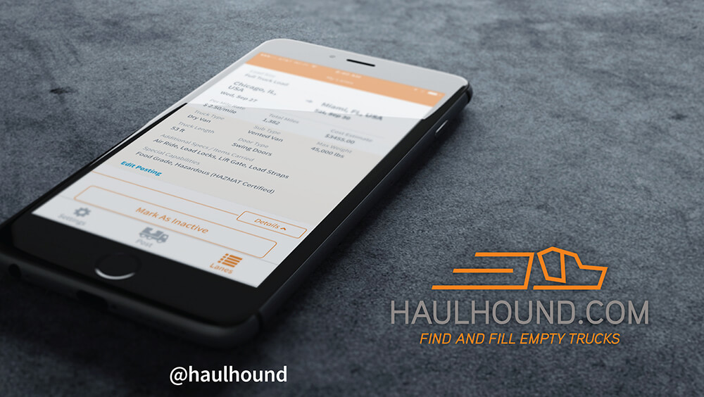
Users could post their availability in an average of one minute forty-nine seconds for their first booking. When lanes were booked, users could easily find their way to accept backfilling their trailers and access the contact information and location of the shipper.
Solution
Once user testing was complete, I pivoted to supporting my development team by writing Stache, which is objective HTML, for the app pages, and styling the UI using LESS.
Success here was twofold - My team and I had the product in the Google Play and App stores the day before the trade show. And the product that we output included everything in our stretch goal – all of the intended Version one features. We exceeded the stakeholders' expectations by creating a product that was further along than what was thought could be achieved in three months.
Users were able to create accounts and start backfilling their trailers on day one. In addition, the stakeholder could promote a functioning application at the trade show and capture the number of signups desired at the trade show.
Impact
Results
In three months, we took the stakeholders' idea from concept to MVP and had the product in the Google Play and App stores before the first day of the trade show. I provided a highly polished application ready to sign up users at a trade show. My work helped the stakeholder promote the concept, get more seed money for the project, and capture users signing up for the service when the app launched.
In addition to my product design work I:
- Refined the HaulHound logo
- Created all in-app icons
- Prepared App and Play store graphics
- Developed marketing and presentation materials
- Created trade show backdrops
- Designed motion graphics and promotional videos for display at the trade show
Achievements
- Provided a solution for users to backfill their trailers
- Gave users the ability to combat "deadheading"
- I worked in tandem with the Lead Developer to vet concepts and align expectations for the build. I made myself available for clarification outside of the documentation and chipped in by writing HTML (Stache) and CSS (LESS) for the project
- I established a great relationship with the stakeholder, making it easy to reach out for answers and to get confirmation on direction quickly
Takeaways
What would I do differently?
If I could do this project again, I would have stayed in grayscale for longer. I never intended the orange to stick; I used it more as a filler color until I defined a color palette. However, the stakeholder bought in on the orange, and we ended up being locked in on the color scheme. For future projects, I waited to share high-fidelity mockups with stakeholders until a color pallet had been defined.
How did I grow?
The short timeline was the biggest challenge for this project. This project helped me to learn that aligning with the lead developer through frequent communication helped things to go smoothly. Additionally, I had established a great relationship with the stakeholder, who saw a lot of value in what I was providing and gave me a lot of trust.
