
am-ui Component Library
A zero-dependency component library with 44 production components and a live Figma-to-code token bridge
Overview
I've been chasing this since I started designing websites in the 1990s: how to get a style guide out of the design tool without it drifting from the code. Twenty-five years of trying different tools and approaches taught me the idea was right long before I had what I needed to actually build it. AtoMagic, a Figma plug-in I built with a developer friend in 2021, got the closest of any of those attempts, proving the idea worked in usability testing, but it never shipped past that proof of concept. am-ui is the version that actually exists, a zero-dependency component library with vanilla HTML and CSS as the source of truth, a 1:1 Figma library, and a token bridge keeping the two in sync.
Role
Product Owner, Product Designer, Front-End Developer
Scope
One week to build (independent), ongoing maintenance
Tools
Figma, Storybook, Playwright, Node.js, HTML, CSS, JavaScript, Claude
Approach
Problem Statement
Most teams end up choosing a design system or a component library, not both kept in sync. Starting from a design system means either building custom components from scratch in whatever front-end stack the project uses, or finding a component library and fighting its existing CSS to make it align. A handful of tools claim parity between the two at the start, but none I've found keep that connection consistent as a project evolves; the two drift apart within a few sprints because nothing enforces the link. Component libraries that avoid drift usually do it by becoming a shared dependency everyone has to update in lockstep, trading drift for lock-in instead. And most aren't built with a clear path to a specific framework, so adopting one still means a slow, error-prone manual translation.


“The lesson from AtoMagic holds: don't give up on a problem just because the tools aren't ready yet.”Ryan Wilson
Goals
- Give any new project a real, working set of design tool and coded components on day one
- Keep Figma and code from drifting apart by making design tokens the single source of truth for both
- Make every component convertible into React, Vue, or Angular without an army of manual re-implementation, by giving each one a machine-readable spec an AI can convert from reliably
- Meet accessibility and responsive-design basics from the start, then document honestly what's actually been verified versus what hasn't
Process
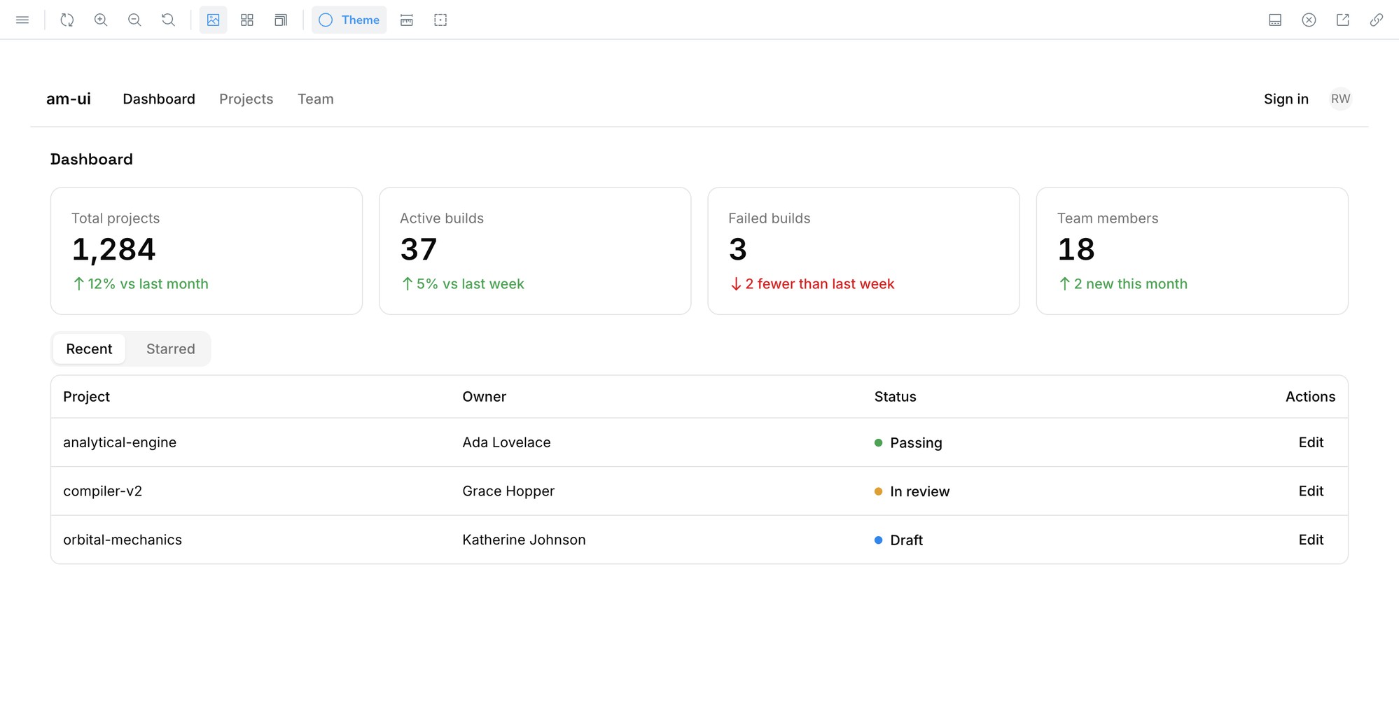
am-ui ships as a starter copy, deliberately unstyled in a flat gray "wireframe" theme, the same "stay ugly as long as possible" approach I use elsewhere: keep early attention on structure and flow, not color and polish. Because every component is unstyled from day one, a team can build real, coded pages against the library immediately, before any design work is finished, pages that look like wireframes because the components genuinely are wireframes. As the real design comes together, the two sides stay in parity through the token bridge: a developer changes a token in code and Figma picks it up on the next pull, or a product or design person hones a component in Figma and pushes it through, and the coded front end updates to match. Either way, the working front end is already there, filling in visually as the tokens firm up instead of getting rebuilt once the design is finalized. Retheming a project's real brand onto it later is the same one-place change to the token values, not a rebuild.
- Design Tokens
- Component Architecture
- Figma Library
- Design-to-Code Bridge
- Storybook Documentation
- Accessibility & Responsive Audit
- AI-Assisted Conversion Workflow

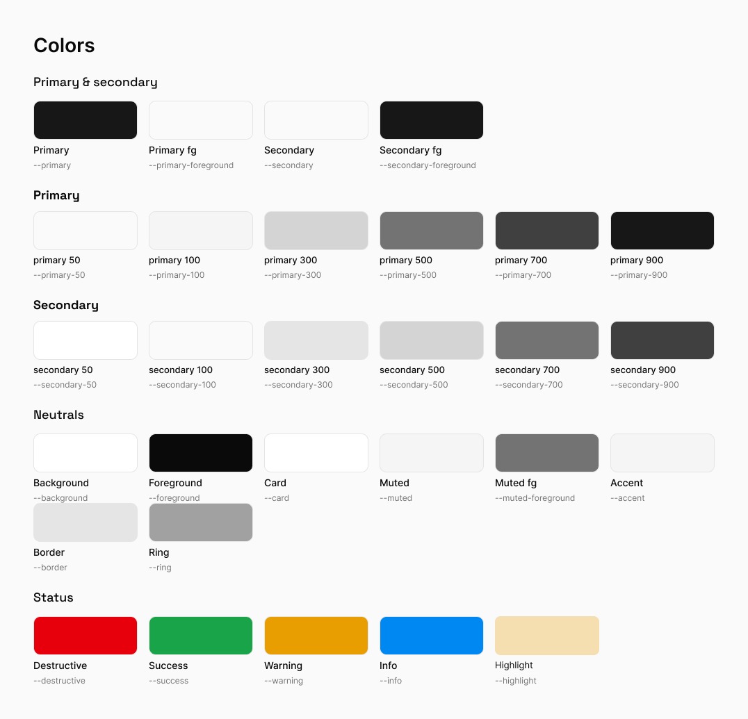
I built the token layer first: color as OKLCH with light/dark modes, spacing, radius, a type scale, elevation, and a border-width scale derived from spacing. Every component was built against those tokens, never a hardcoded value, so the same component looks right in either theme without being touched. From there I worked up through Brad Frost's Atomic Design tiers (atoms, then molecules composed from atoms, then organisms composed from molecules), keeping each component's anatomy consistent so the pattern stays predictable as the library grows.


am-ui had to work in any framework, not just vanilla HTML: fighting another framework's own CSS on top of yours is its own kind of pain, so each component splits into layers that convert differently. The CSS itself is framework-agnostic and drops in verbatim, the markup is a mechanical translation, and interactive behavior (modals, dropdowns, tabs, a data table) takes judgment to reimplement in the target framework's idioms. That conversion model is documented as CONVERSION.md and validated against a real React conversion, so the traps a naive AI-driven conversion gets wrong are already known going in, not rediscovered per project.
The other half of the AtoMagic problem, Figma and code drifting apart, is handled by a token bridge that treats a JSON file as canonical and generates the CSS from it, with push/pull/watch commands to sync either direction and a CI check that fails a build if the two ever disagree.
Findings
I ran an automated first-pass accessibility and responsive audit (Playwright, three breakpoints) rather than claiming a compliance standard I hadn't actually verified. The audit passed, but real screen-reader and keyboard-only testing is still outstanding, so I'd rather call it built with accessibility in mind than claim WCAG AA compliance before a human has checked it. That's true of am-ui generally: being built accessible doesn't remove the need for whoever adopts it to do their own accessibility and responsive review before going live, on any project.
Solution
Every visual value in am-ui traces back to one token file, mirrored 1:1 into the Figma library, so a designer and a CI pipeline are checking the same source of truth instead of two that quietly drift apart. The library deliberately targets evergreen browsers (~Baseline 2023), since its color system is authored entirely in OKLCH with color-mix, a real constraint I documented instead of hiding it.
Impact
Results
- Teams start writing real, coded pages on day one instead of waiting on final visual design before any markup exists
- Design and code stay in parity for the life of a project, not just at kickoff, so there's no reconciliation pass to do before shipping
- Product and engineering work from the same token source instead of a handoff that loses fidelity in translation, with drift caught automatically instead of relying on someone noticing
- Moving to React, Vue, or Angular is a known, validated process, not a guessing game re-solved on every project
- Accessibility and responsive basics are true from day one instead of a bolt-on audit pass at the end
Achievements
- Solved the design-to-code automation problem AtoMagic got closest to, this time building every layer directly
- Documented accessibility honestly as "pending validation" rather than claiming a compliance standard I hadn't verified
Takeaways
What would I do differently?
am-ui is v1.0, not a finished product. It's usable and shareable now, but there's more to learn as I actually build with it, not less. Real screen-reader and keyboard-only testing is the next thing on my list to pressure-test, and I'd rather close that gap for real than claim a compliance standard before a human has checked it.
How did I grow?
What changed wasn't the idea. It was that the tooling finally caught up. Mature CSS (OKLCH, color-mix, :has()) and AI-assisted conversion made it possible for me to design and build every layer of this myself. The lesson from AtoMagic holds: don't give up on a problem just because the tools aren't ready yet.